
Welcome to a private view at Burgh House
The Prospect of Happiness
Architectural Portraits and Word-Landscapes
by lettering artist and studio potter Liz Mathews
Come in through the wisteria-clad front door of Hampstead’s Burgh House to find a virtual glass of wine and a warm welcome to this tour of The Prospect of Happiness, an exhibition that draws together portraits of some beloved London houses with the words of some well-loved writers on their favourite London views.

The exhibition is designed in three areas for the gallery: portraits to the left, artist’s books to the right, and straight ahead, a long view with pots and word-landscapes on handmade paper. In this virtual tour we’ll be able to move between the sections, exploring connections between the works; and here and there you’ll find extended captions with back-stories, close-up photos and details of making techniques.
We begin with Burgh House itself and circle out from here, taking a walk together round Hampstead, the Heath and my home patch of North London before venturing further afield across the city, and down to the river.
— | —

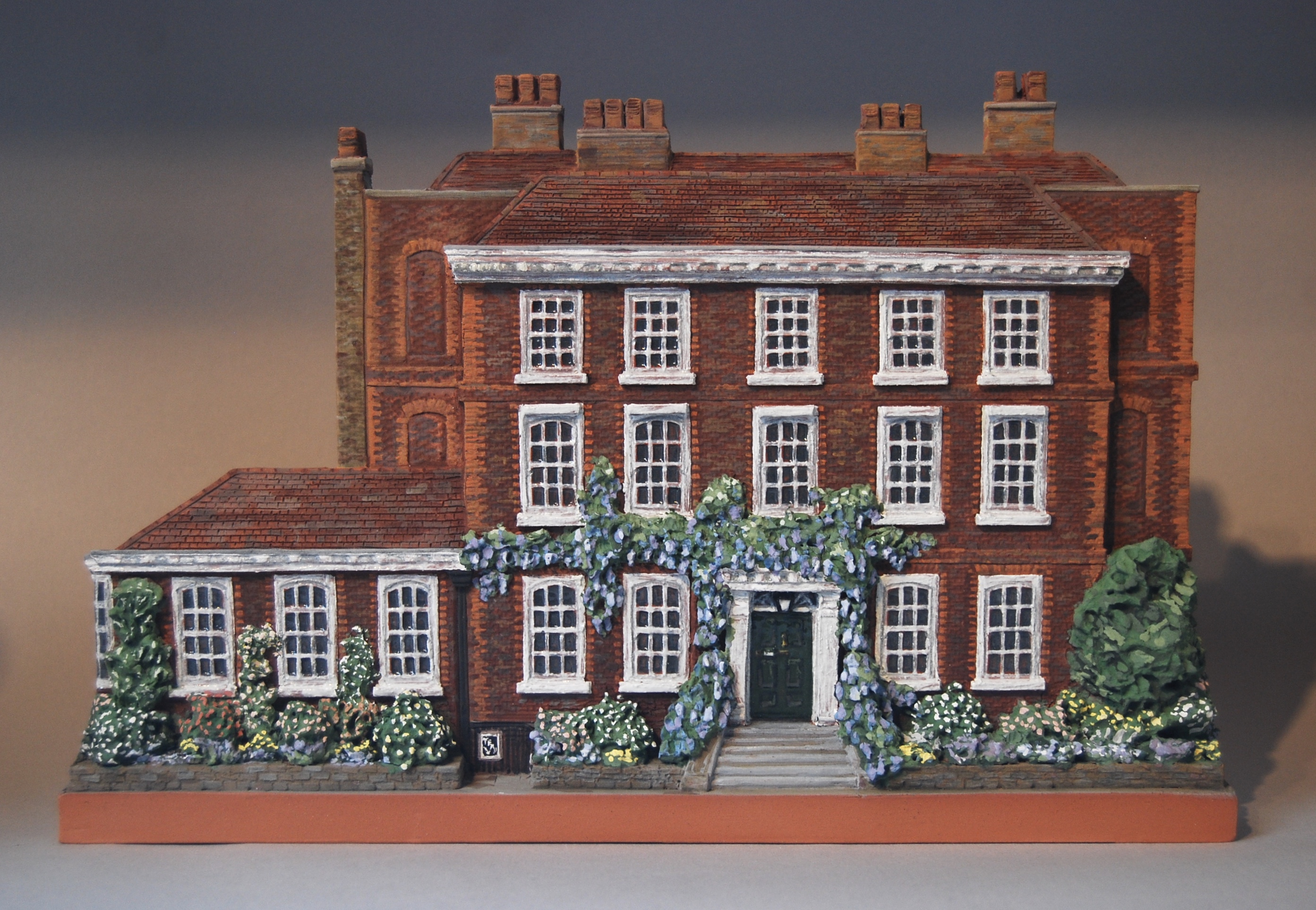
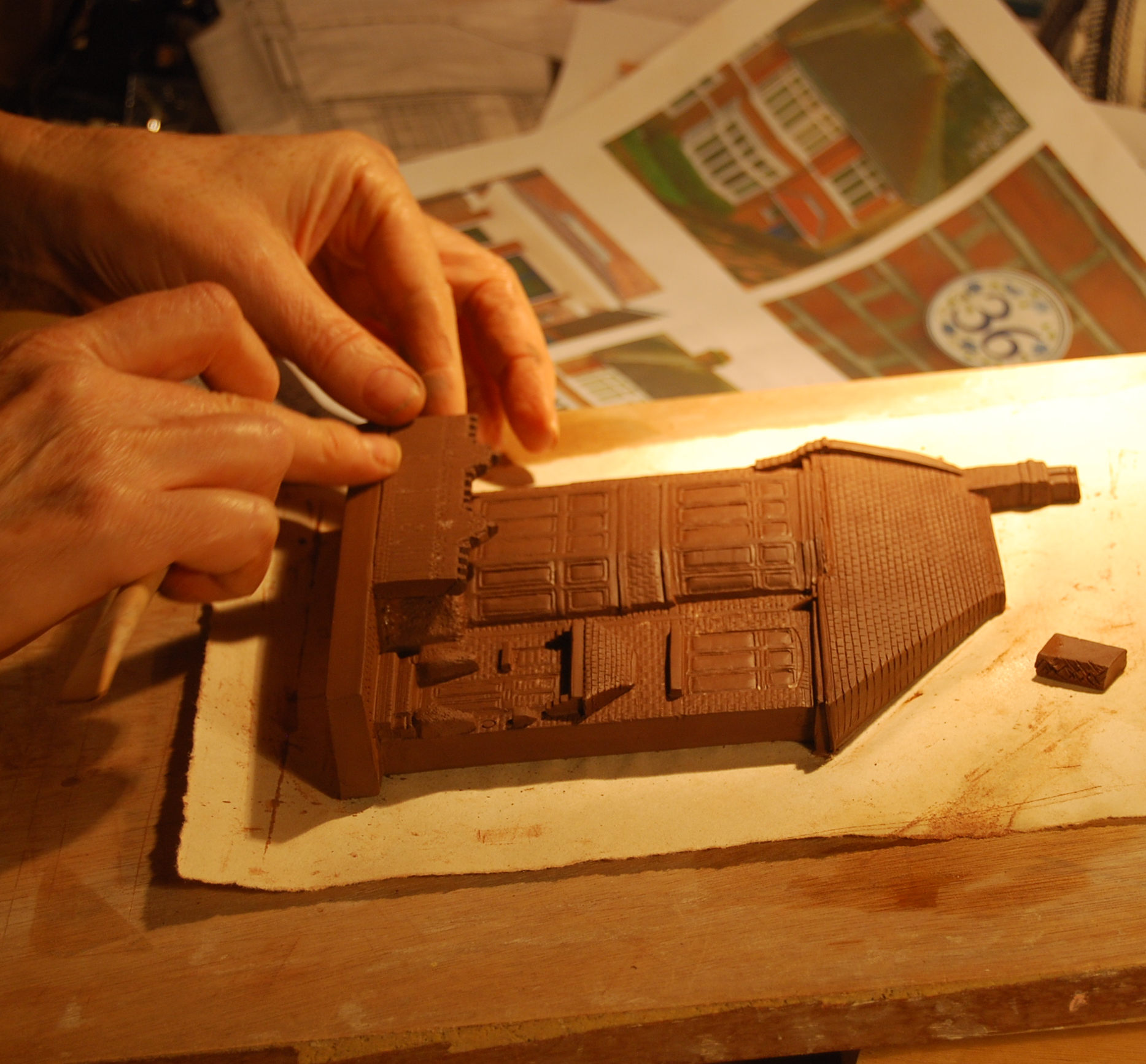
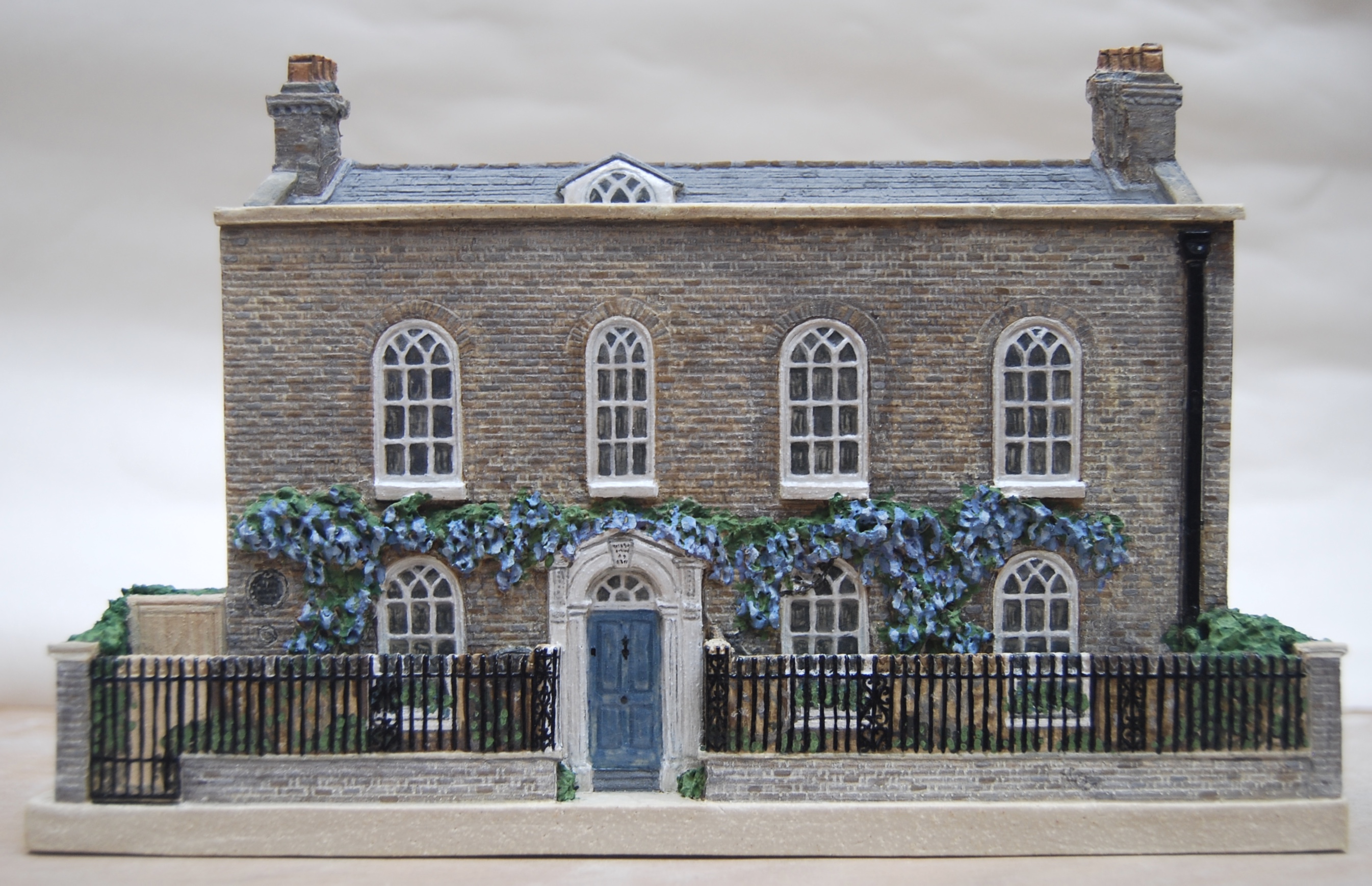
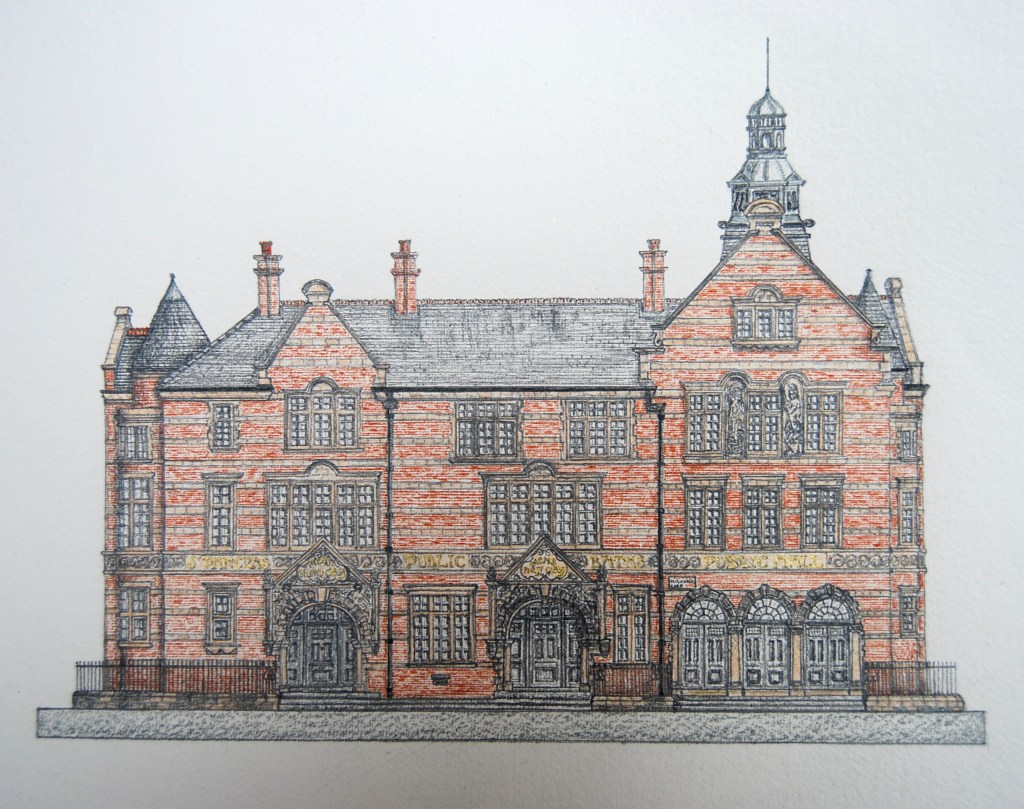
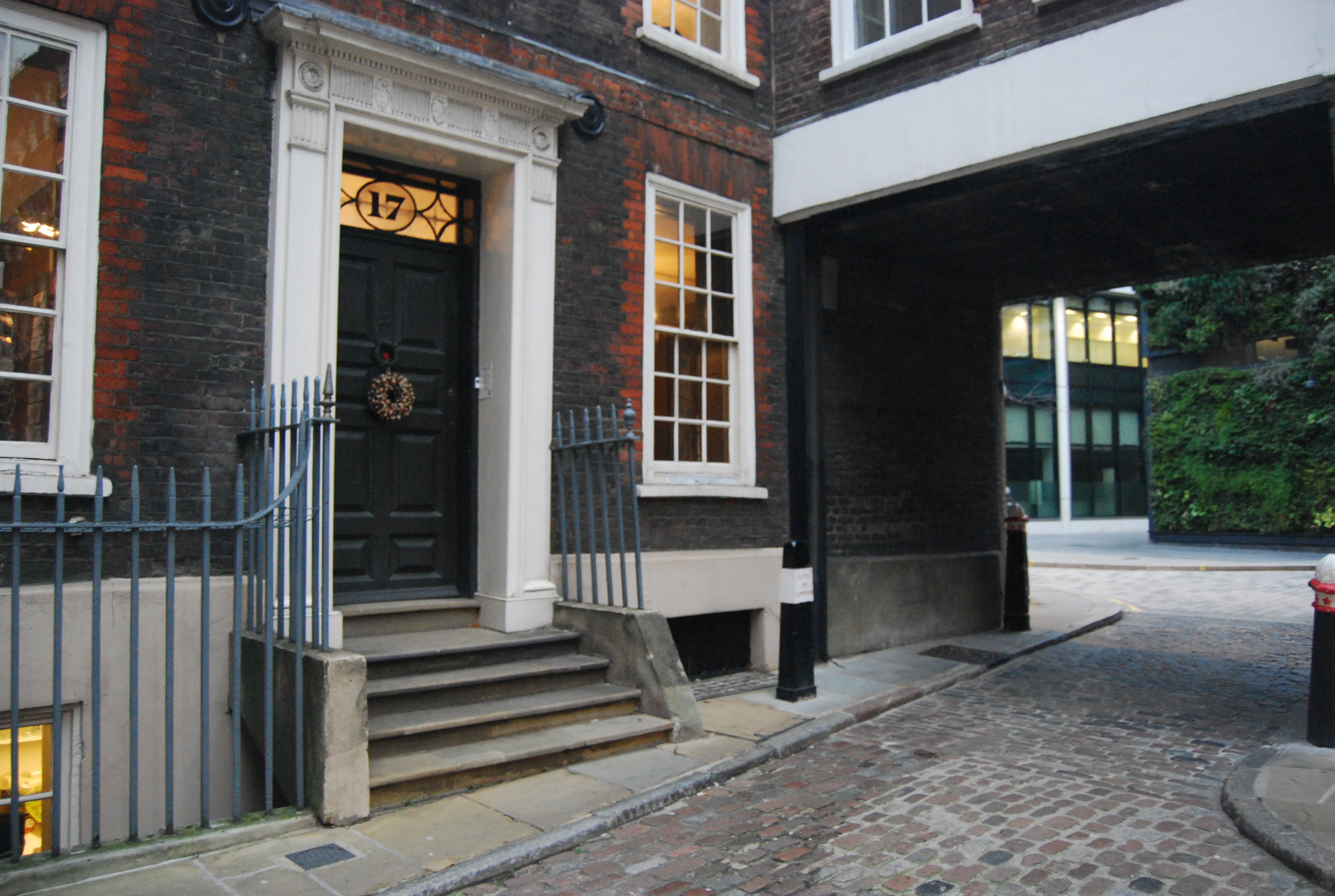
Burgh House in May
Architectural portrait in terracotta, with underglaze oxides and a clear glaze, fired to 1040 degrees, dimensions 27cm x 17cm x 3cm. Inscribed ‘Burgh House’ on reverse, and signed.
Burgh House looks lovely in all seasons, but perhaps at its best in May when the wisteria is in full bloom and the garden (designed by Gertrude Jekyll) gives a charming context for its warm-toned brickwork and perfect proportions. This year the wisteria is particularly fine, I understand, so I’m glad the boughs were heavy with scented racemes when I photographed the house last year for this portrait.
I love making miniature portraits in clay. There’s something special about the way a portrait that’s made in the same material as the building can achieve a likeness and a real physical affinity with the subject. I’ve been making house portraits and architectural low-relief sculptures for 35 years now, and each subject has been fascinating, with its own special characteristics and challenges. Burgh House is built with beautiful Georgian terracotta bricks, and its later additions follow the style of the original house very harmoniously. The portrait is made from the same kind of clay as the original bricks, a warm terracotta, fired to a similar temperature, and so it has the same qualities of porosity, plasticity and iron-bearing colour; the only difference is that my hand-building clay is much cleaner than the brick clay would have been, and has less sand and grog, so I have a finer surface to work with. The base of the portrait shows you the smooth texture and colour of the fired clay, un-decorated and bare of glaze, and the flat back is hand-lettered with an inscription and signed with my mark.
(More about making Burgh House’s portrait here.)
— | —
We live and work at Potters’ Yard in Tufnell Park on the other side of Hampstead Heath, and when we visit Burgh House, we usually walk across the heights of the Heath, looking out over London on our way:

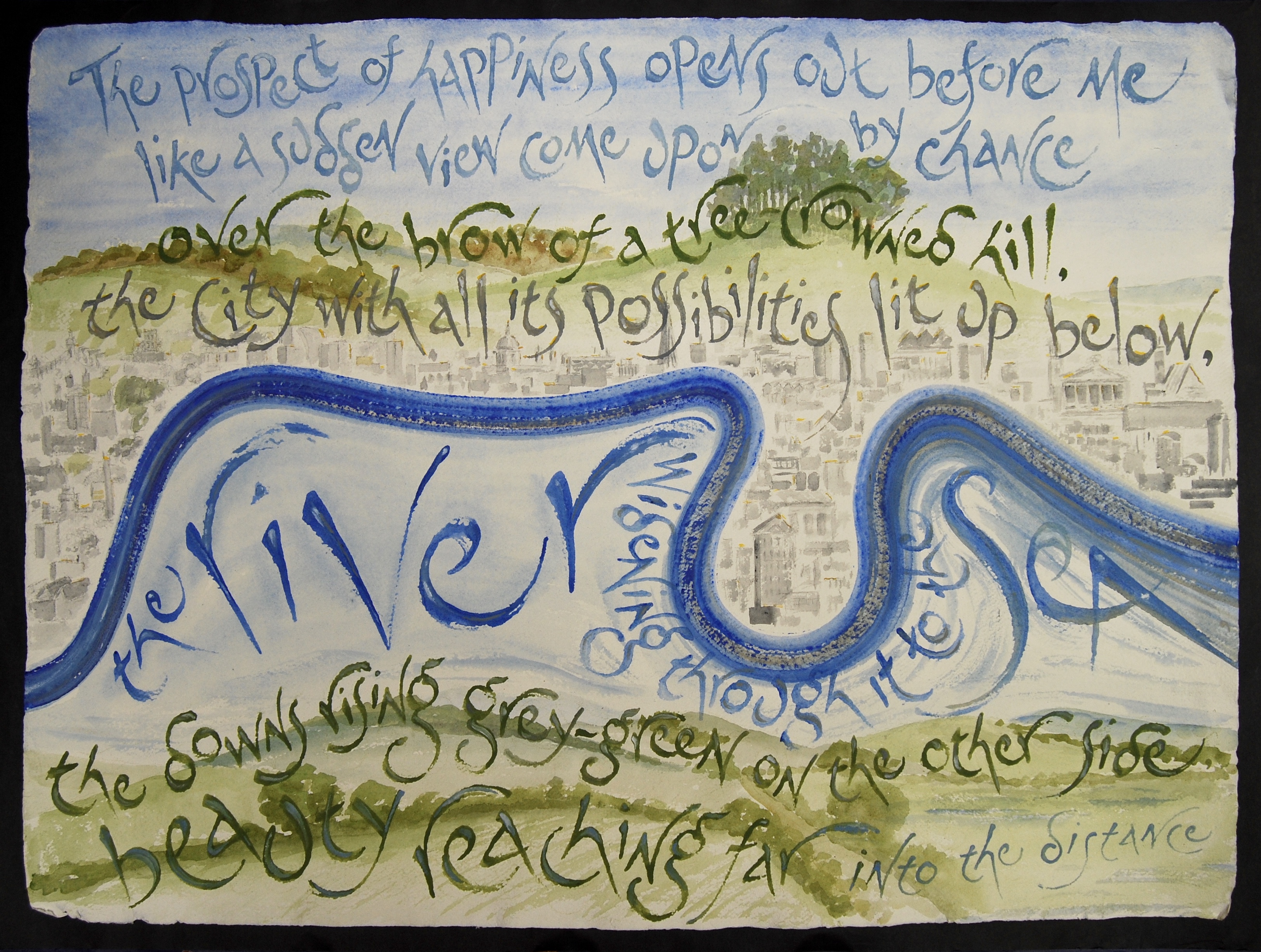
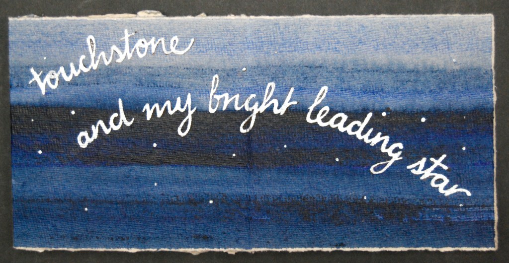
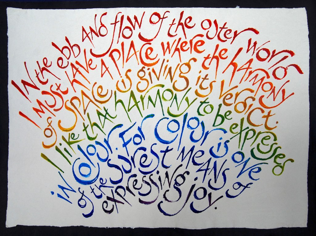
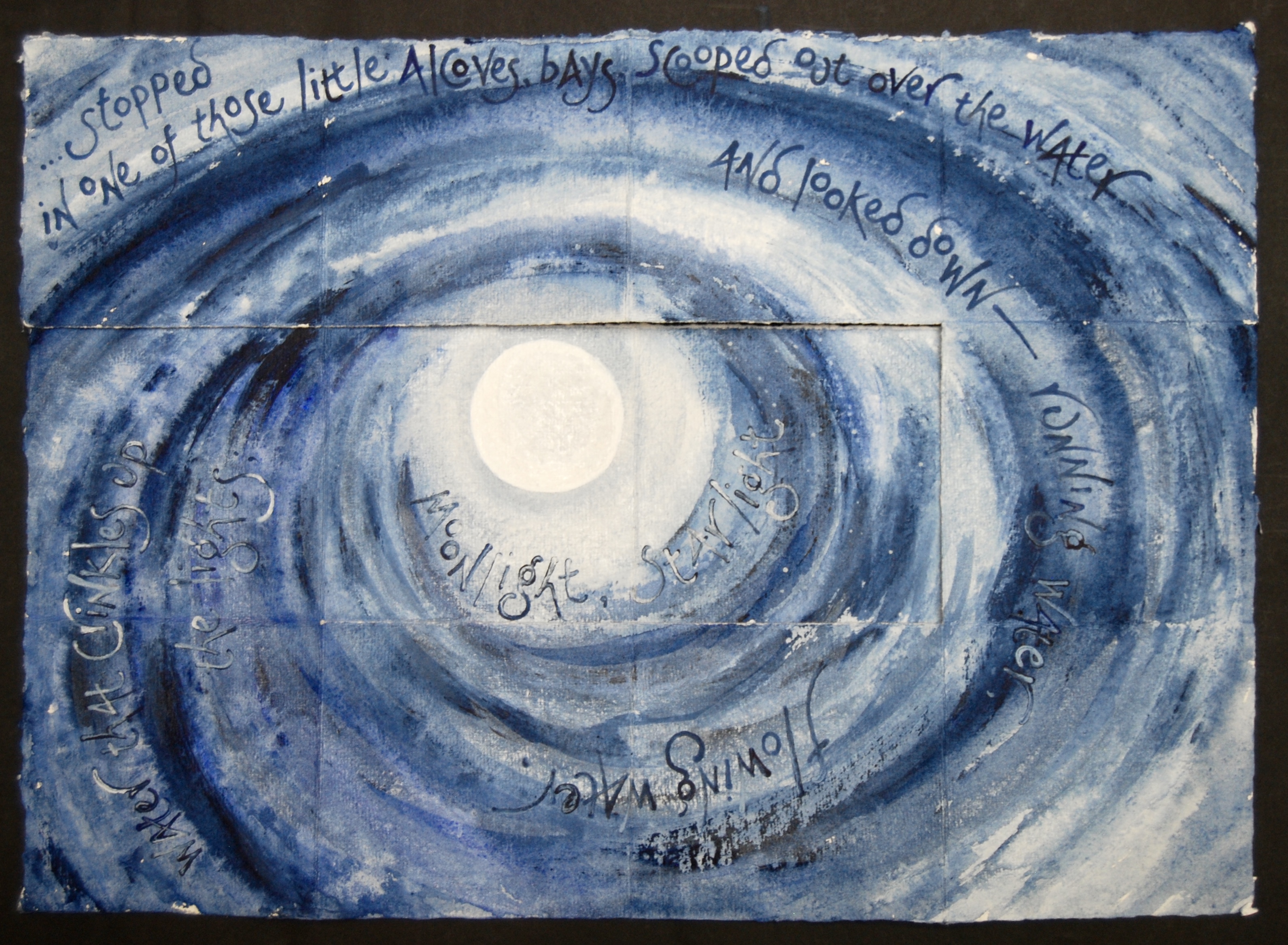
The Prospect of Happiness
Paperwork on handmade paper 52cm x 71cm, painted with watercolour paints mixed with Thames water, and lettered with a beech stick from one of the Heath trees, and a driftwood stick from the Thames for the river lettering.
This paperwork is the centrepiece of the long wall facing the gallery entrance. The words that give the exhibition’s title are from Frances Bingham’s 2011 novel The Principle of Camouflage, and the speaker, Fitz, has just returned from wartime exile to beloved London, and climbed to the Heath’s heights to look out over the city and the future. I’ve thought about these words of hope often lately, remembering how, after all the pain and trauma of the war, Fitz looks forward to happier times with resolution as well as optimism. I’ve used Thames water and twigs from the Heath for the lettering, to bring the material presence of this view into the work, and the watercolour of the city spread out below includes some indications of landmarks – St Paul’s, New St Pancras Church (Virginia Woolf’s favourite London church), the British Museum, our house – all the important ones. I like to think of this paperwork as an incantation, bringing together the good things about our city, and possibilities of the future, under those optimistic words
The prospect of happiness opens out before me.
— | —
2 Willow Road
Architectural portrait in stoneware, with underglaze oxides and a clear glaze, fired to 1250 degrees; dimensions 26cm x 11cm x 4cm; inscribed 2 Willow Road on reverse and signed.
2 Willow Road is a National Trust property in Hampstead, built around 1937 – 39, designed and lived in by Erno Goldfinger. It was acquired by the National Trust in 1994 as their first modernist house. It’s an exciting subject for a portrait: the variations of plane within the continuous street frontage are almost as complex as Kenwood’s, and the variety of materials also gave me an opportunity to play with the textures achievable in clay. The portrait is made in a high-firing creamy stoneware that has the structural strength required to make the columns – the tricky bit. I enjoyed showing the lively interiors clearly seen through the plate glass windows; glazing the windows of the portrait after first painting a trompe l’oeille of the view inside gives the portrait the effect of proper windows glazed with actual glass.
(Like Burgh House, 2 Willow Road is one of the Small Historic Houses of London; more on my portraits of this collection here.)
— | —
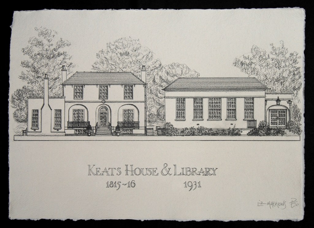
Keats House and Library
Architectural drawing on handmade paper, in pencil with Windsor and Newton acid-free artists’ fixative; dimensions 42cm x 30cm
Just round the corner from 2 Willow Road is the serene enclosure of Wentworth Place, where John Keats lived for a couple of years from 1818. At that time the house (on the left of the drawing) was two dwellings in one single villa: Keats lodged with Charles Brown in the easternmost or the left-hand half as seen here from December 1818, and Fanny Brawne, Keats’s love and original girl-next-door, moved in with her family in the right-hand-side in 1819, inspiring Keats’s greatest happiness and his greatest work. Wentworth Place was built here close to the Heath in 1815/16 – a Regency semi – but after Keats left, the two houses were converted in 1838/39, when one of the staircases was removed, and a one-storey entertaining room and conservatory was added (seen to the left in this drawing) – this area would still have been part of the garden in Keats’s time. The house was saved from demolition in 1920 by a protesting public, and became a museum in 1925. The Library, to the right here, is a much later design, harmonious though the pair now seem – ‘discreetly designed in 1931 by Sidney Trent’, as Pevsner puts it.
I made this portrait on paper as seemed appropriate both for the poet and the library – and it’s a fine example of how a place, much altered since its moment of greatest note, still can retain something of the character and atmosphere of that time. We often visit the house and garden, and go to poetry readings in the library, and in the portrait I aimed to catch something of the serenity of the leafy green space, surrounded by trees and birdsong, and perhaps something of the poetic spirit that still survives two hundred years after Keats’s time there.
(Keats House is another member of the Small Historic Houses collection: more here.)
— | —

Talisman
Artist’s book made from a single sheet of handmade paper 42cmx 30cm; lines from Darkling by Maureen Duffy, by kind permission of the poet.
Maureen Duffy’s poem Darkling addresses John Keats directly, poet to poet, and asserts that the poet’s words are his ‘true portrait’. I found an example of Keats’s handwriting in a letter (now in the Bodleian Library) to Shelley on August 16th 1820 – and imitated his flowing script with a steel-nibbed pen such as he would have used in sepia ink that resembles the colour of the faded once-black ink of the letter. The handmade paper is a soft creamy grey clay colour, not unlike the aged paper of the letter, and I used this unadorned as the background for the book’s first two pages, painting a starry sky in watercolour for the rest of the sheet. The words circle round, high-lit in silver paint over the brown ink to shine against the sky, with the stars splashed about in silver.
For me the book form shares some qualities with the low-relief portraits in that it can contain so much – the physical book itself is a vessel, a volume filled with meaning and reference, so that the object and the meaning can become one – a talisman. It can contain not only the words of the poem, but Keats’ words too, ‘shimmering down the years’.
(More here on making artist’s books from a single sheet of paper.)
— | —

Fenton House
Architectural portrait in terracotta, with underglaze oxides and a clear glaze, fired to 1040 degrees; dimensions 25cm x 19cm x 4cm. Inscribed Fenton House on reverse and signed.
Like 2 Willow Road, Fenton House is also a National Trust property: 1693 is the date found on a brick in the chimney stack – communicative terracotta again. The compact square-plan house has three fronts that the visitor can see: this is the East front, with its lovely Doric entrance loggia, and the charming little balconies, accessed by a small door in the attic rooms. Each front shows a different character – the South with a beautiful pediment, a high hipped roof with a steep pitch in 17th century tradition and a chaotic roofline; the North or garden front with its service basement exposed by a drop in the ground level for the garden, allowing for elegant terraces embracing the lawns and an impression of considerable height – and each is livened by the same brown brick with red brick quoins and window facings. The fourth, hidden side has all the quotidian domesticity of the service and stable yard, with a barn and stores nearby, and hardly any windows overlook this area, so that the washing lines were never on view. The gardens are an unexpected delight, especially the orchard, and last time we visited, late in August, early Worcesters and Discovery apples fresh from the tree were arrayed in baskets in the loggia.
(Fenton House is another of The Small Historic Houses of London; more here.)
— | —
Among Fenton House’s distinguished neighbours was Constable, whose nearby house high on Hampstead Grove gave him ample opportunities for his cloud studies:

Constable’s Clouds
Artist’s book with words and cloud composition by John Constable, on handmade paper 50cm x 70cm open, or closed 19cm x 19cm x 1cm, in slipcase 21cm x 21cm x 1cm
This artist’s book, like Talisman, is made from a single sheet of handmade paper, painted, folded and torn into a sequence of six double pages – but can be opened out to the whole sheet and framed. I particularly enjoy the dual nature of these books – the volume containing a painting, or the book hidden inside the picture. The words are from Constable’s notes for cloud and sky-studies in 1821, describing the skies of the Heath and the view from the top of this hill. As I write in these weeks during the lockdown, with the usual noise of planes and the London traffic roar shrunk to a whisper, the skies above the Heath have returned to almost the pristine state that inspired Constable so much, clear and full of birdsong and breezy freshness – the sunshine of the heart.
(Constable’s Clouds page-by-page here.)
— | —


No. 36
House portrait in terracotta, with underglaze oxides and a clear glaze for windows, gloss paint and railings; dimensions 12cm x 18cm x 4cm; inscribed and signed on reverse. Shown by kind permission of the commissioners.
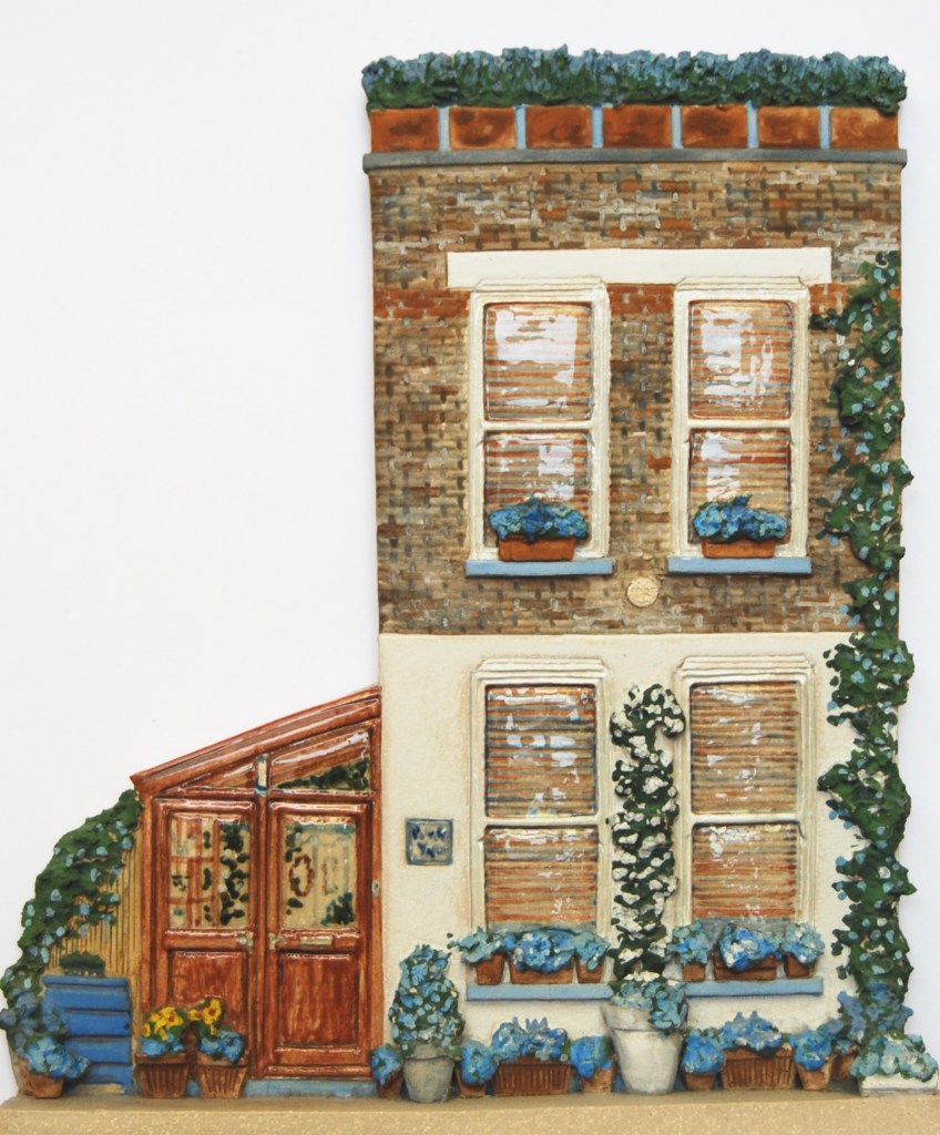
A little further north from Hampstead – nearer to Alexandra Palace, in a quiet leafy residential street can be found this immaculate example of domestic Arts and Crafts building – a modest semi with its harmonious features and decorative detail carefully preserved, and a friendly welcoming face. Cleanly appropriate brickwork, attention to small details such as the fascia corbel and the tiled porch, delightful coloured glass in the original front door and flanking window, a generous bay window, box hedging and an elegantly restored railing frontage make this charming house a classic of the vernacular.
(More on commissioning house portraits here.)
— | —
Westwood Cottage
House portrait in stoneware, with underglaze oxides and a clear glaze on window glass metalwork and gloss paintwork. Inscribed and signed on reverse. Shown by kind permission of the commissioners.
And just a step further NNE again we find Westwood Cottage: built 1794, as it says inside the elegant doorcase, and home to Charles Lamb from 1828 until 1833. This lovely house is graced with a mature wisteria, and its literary past is announced on a weathered roundel, included on the portrait to the left of the facade.

With this commission, a classic Regency cottage, there were surprisingly many features and details for me to draw on to catch a likeness, from the round-headed windows with fanlight glazing bars, to the cogging round the chimney stacks. The railings, too, recently restored to elegance, gave me an opportunity for an artful trompe l’oeille, to produce the impression of a transparent screen, when they are actually made from a solid slab of clay. Behind the railings, each window has its window-box of flowers, which is reproduced in the painting on the front (railing) plane of the clay construction, and then the railings painted on top. Working in low relief often involves a combination of optical illusion and careful modelling, as the portrait can be viewed from several different perspectives, so the visual effects need to stand up to multiple-angled views.
(More on commissioning house portraits here.)
— | —
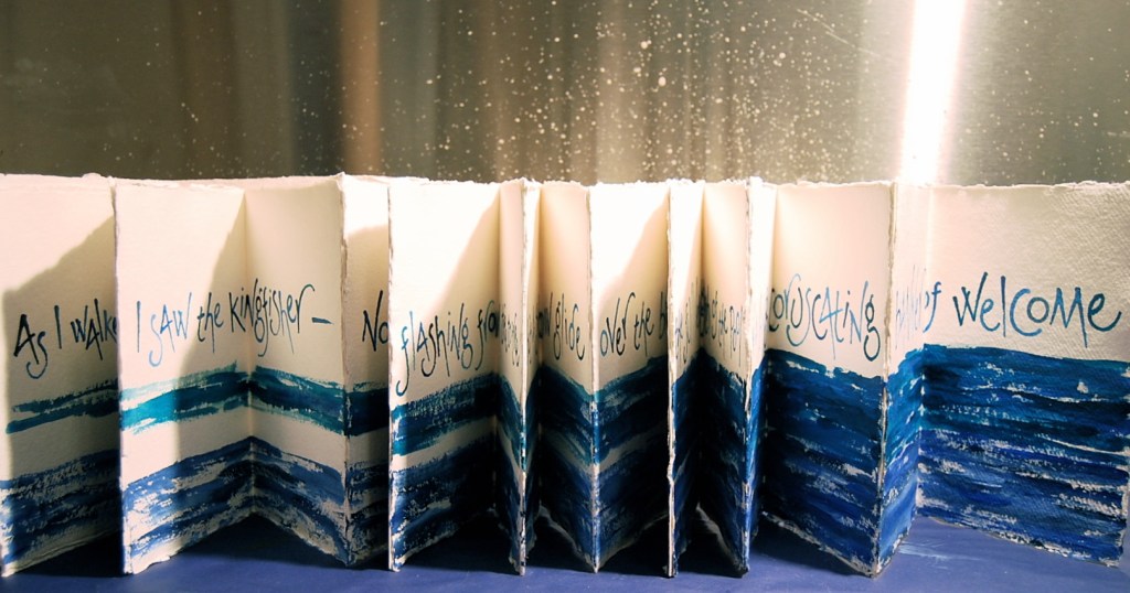
Fitz’s Kingfisher
Artist’s book – concertina form, opening out to a banner, made from handmade paper, acrylics and watercolour, and lettered with a driftwood stick; words from The Principle of Camouflage by Frances Bingham.
Having ventured out into Greater London, we circle back to the Heath now for another unexpected London sight. We love the extraordinary diversity of the birdlife on the Heath, from the flashy parakeets, to the elegant herons, but always hope for a rare glimpse of the kingfisher. Here, Fitz is walking on the Heath:
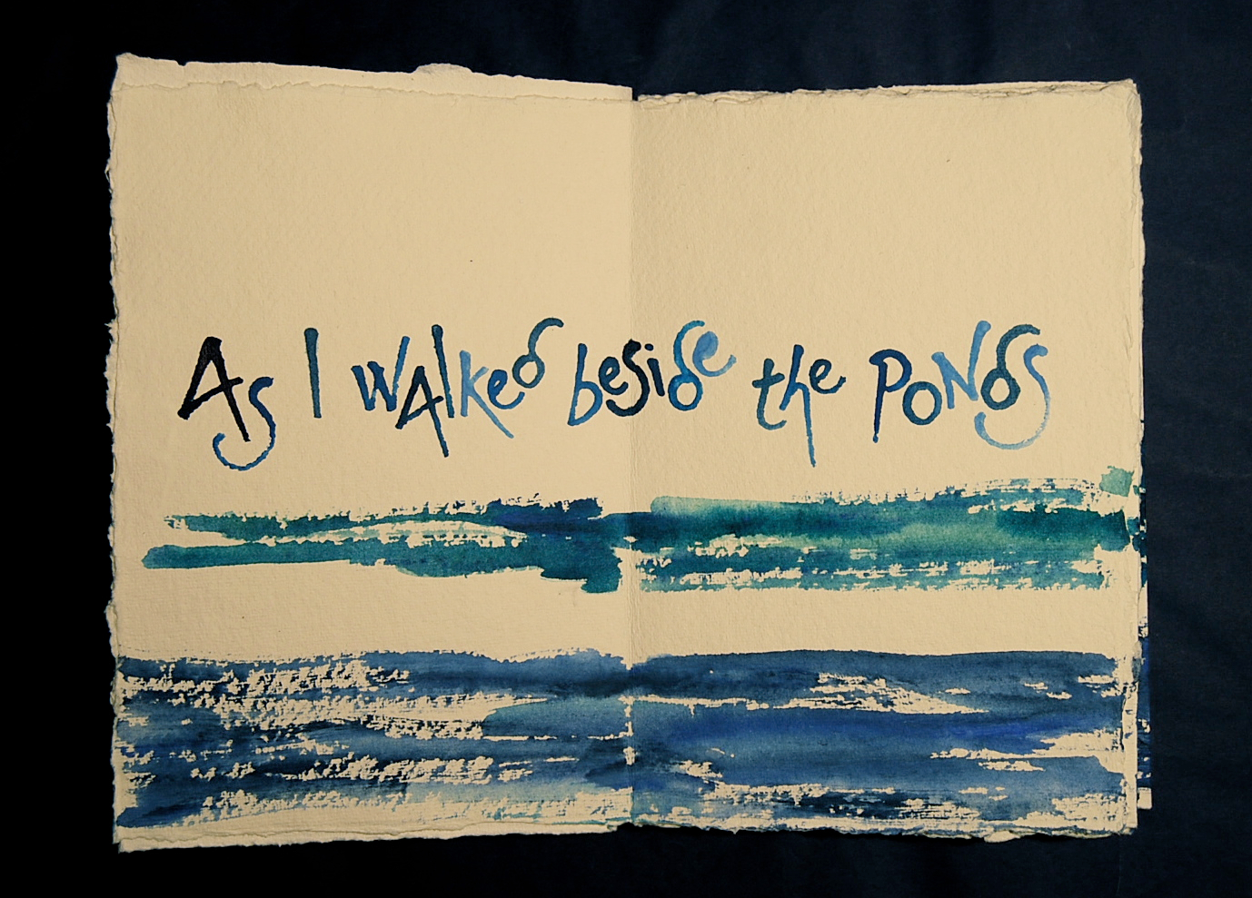


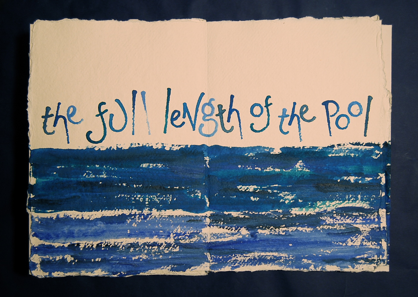
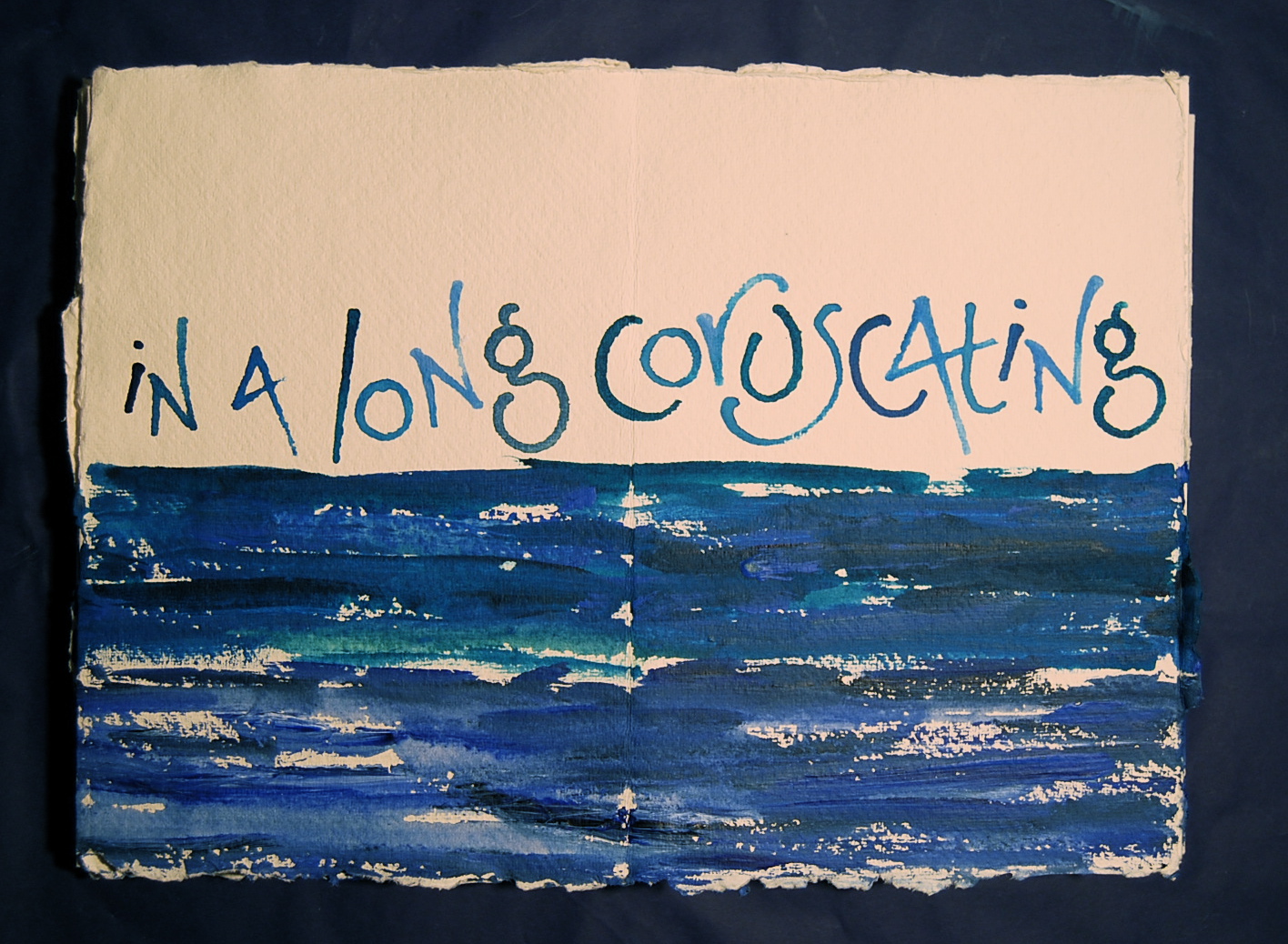

This concertina book can be unfolded to the full extent of its nine pages (2.7 metres) for the full flight of the kingfisher’s banner. The book was constructed before painting, from eighteen A4 pages of handmade paper, with acid-free archive adhesive, and then painted with the pond blue and the kingfisher flash, the two lines gradually mingling towards the banner’s end. The text is lettered with a little driftwood stick from the Thames, one of my favourite lettering tools. The book has a slipcase, as do all my books, made and decorated with the same materials.
— | —

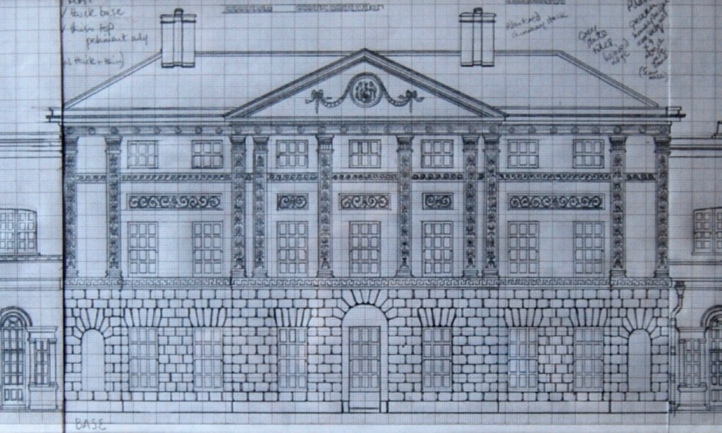
Kenwood – a study for a portrait
Working drawings for clay portrait: pencil on graph paper, three drawings for interlocking relief panels with construction and detail notes. Dimensions 80cm x 18cm
Kenwood – Pevsner’s ‘finest eighteenth century house in North London’ – is another of our favourite destinations by the Heath – both its wooded grounds with Barbara Hepworth’s Monolith (Empyrean) and Henry Moore’s Reclining Figures, and of course the recently restored house. The view from the south as we approach from the Heath is like a vision of a fairy palace floating on a lake of green.
For this exhibition I wanted to show some of the different stages of the making processes for my architectural portraits, and this study includes the three working drawings for a portrait of Kenwood, ready for transfer to the clay slabs and the construction of the portrait. The house is too long in proportion to its height for the clay to accommodate in a single portrait, nor would it fit on my kiln shelves in one piece. So the solution is to make it in three sections, with a joint either side of the central nine-bay range, making the slightly recessed anterooms that lead to the orangery (left) and the library (right) underlap the main front so that the joint is hidden, though it is clearly seen in the divided base. Because of the surface detail that this beautifully articulated facade requires in a portrait, I’m making it in a fine creamy architectural stoneware with a very smooth texture, that allows plenty of detail in the working. But I like to think these pencil line-drawings catch something of the airy insubstantiality of the fairy palace.
Virginia Woolf was an early visitor to the newly restored Kenwood (‘Caen Wood’) in the early 1930s. (More on this here.)
— | —
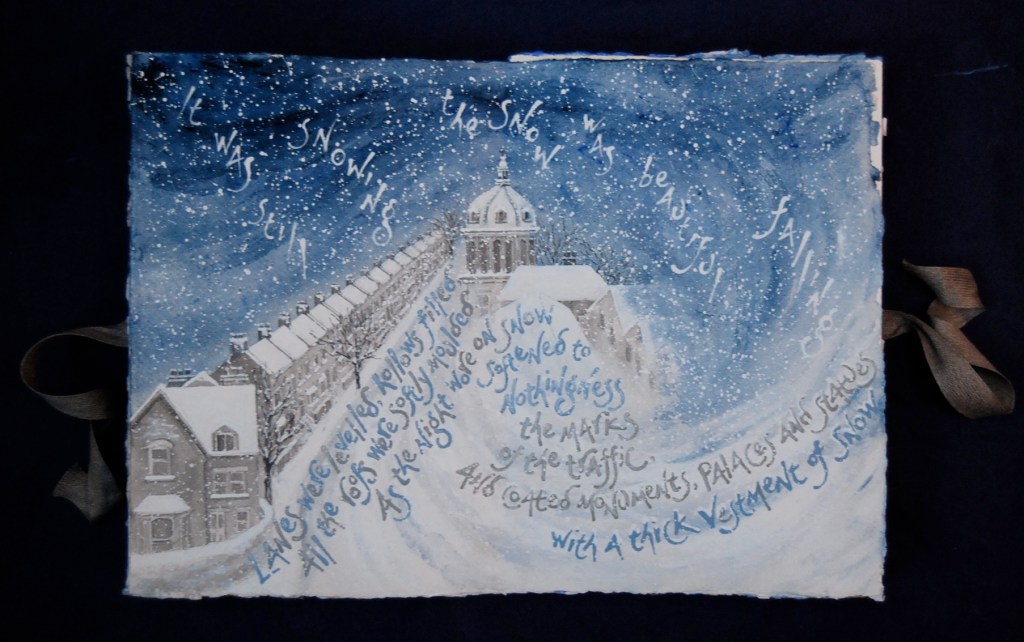
February night: page from an artist’s book From Grass to Harvest
Artist’s book made from 24 sheets of handmade paper each 42cm x 30cm, constructed to a double-sided concertina book with one page for each month; the December page can be joined to the January page with linen tapes to form a circle reflecting the unending cycle of the year. This page was painted with acrylic paint mixed with snow-melt.
This is the February night page of an artist’s book From Grass to Harvest, with a wintery scene from Virginia Woolf’s The Years. Set in London, Woolf’s novel gives a vividly detailed picture of the changing city through the seasons and over one woman’s lifetime. Virginia Woolf knew north London well, visiting not only ‘Caen Wood’, but also regularly taking the bus (‘beloved omnibus’) down Tufnell Park Road, just south east of the Heath (our own local bus, and a sacred bus-route) to visit her great friend the art critic and ‘discoverer’ of the Impressionists, Roger Fry, who lived on Huddlestone Road. For From Grass to Harvest I made a selection of scenes at different times of year, and gave each month a page, alternating day and night scenes, and often setting the words in London places familiar to VW. In this February night page, the ‘beautiful’ snow falls on Tufnell Park Road, the northern-most end which rises towards Highgate and the Heath, (with the number 4 bus stop on the left). And in the image here, you can see the artist’s book opened out like a concertina, with pages from May to November visible.
(Read the book in more detail in this extended caption: Page-by-page views of From Grass to Harvest here.)
— | —
Potters’ Yard
House portrait in stoneware, fired to 1260 degrees, with underglaze oxides and a clear glaze on windows, the house name-plate to the right of the door, and the pine Yardroom which is our small pottery showroom. Inscribed and signed on the reverse.
Making a portrait of one’s own house can be difficult owing to its over-familiarity, but I made this one only a few years after we arrived, when we’d just restored the windows back to proper sashes. I’ve made portraits of all the places we’ve lived since we set up our first pottery in 1986 in West Hampstead, not very far from where we are now in our fourth – and I’ll show you our third a little later in this tour. Potters’ Yard proved to be a good subject – not for its beauty, like some of my commissions, but rather for the challenge of its plainness.
It’s a quirky little house, built in 1980 on the footprint of the coachhouse of the much larger house next door, so internally it’s quite boat-like, as it narrows almost to a point at the back. Its design and levels follow that of the big house, so we have some terracotta courses in the creamy grey London brick, and a rendered ground floor, as well as four tall windows in the flat front face to echo next door’s proportions and details.
But there’s not much else to work with, apart from the flowery yard. So I included as much as possible of that in the portrait, from the plant pots on the paved ground, climbing upwards with clematis and jasmine past the window boxes on all four windowsills to the lavender hedge along the top parapet, in big terracotta boxes which castellate the front wall of our roof garden. The pine Yardroom beside our front door is like a light-box; this small showroom for the pottery is where I’ve taken almost all the photos for this tour.
(Our house is the image for the Contact page on Potters’ Yard House Portraits.)
— | —

Meteor
Bowl in white stoneware, 21cm high x 26 diameter, with underglaze oxides and a clear glaze inside; words by Giovanni Pascali from his poem The Meteor, translated by EJ Scovell
Our roof is a wonderful place for star-gazing, even with the nightlights of London around us, and summer nights often find us out there, gazing up into the heavens. This poem expresses something fundamental about the connection between the earth, the clay and the body that is at the heart of my work.
‘The light of its great stars was round my head
So that I knew
I was of earth indeed
and earth of the stars.’

(More on pots thrown on the wheel here.)
— | —
St Pancras Public Baths, Kentish Town
Architectural portrait on handmade paper, with terracotta and stone coloured pencils and gold acrylic paint. Inscribed and signed on reverse.
Just down the road from our house is this effervescent building overflowing with joie de vivre – the public baths at Kentish Town (by TW Aldwinckle 1898), described by Pevsner as ‘especially festive’ and full of ‘fun and games’. I have a particular passion for the combination of architecture and text, a lettered facade, and Kentish Town bath-house is labelled in gold Art Deco lettering with its name and function, but also – above the doors, helpfully with the designations: ‘Men’s Second Class’, and (poshest central door) ‘Men’s First Class’. The other doors to the right that you might expect to be for women (perhaps of first, second and third class) are labelled ‘Public Hall’. (Oh well, we’ll have to bathe in the Ladies’ Pond on the Heath then – ‘No men or dogs beyond this point‘.)

I’ve chosen, somewhat perversely, to make the portrait of this particularly terracotta palace of pleasure on handmade paper rather than in clay partly because of this text, but also because I love a challenge, and I wanted to see if I could capture something if its intriguing facade-articulation and sparkling chiaroscuro in two dimensions, just with a coloured pencil and some modelling, and without the aid of the clay-affinity I spoke of earlier. It’s the kind of building that one can pass every day in London, and it never fails to raise a smile.
(More on my portraits on paper here.)
— | —
Prism II
Paperwork on handmade paper 70cm x 50cm, with acrylic paint lettered with a wooden clothes-peg. Text by Winifred Nicholson, from her article ‘I like to have a picture in my room.’ Titled, text attributed and signed on reverse.
Speaking of joie de vivre, Winifred Nicholson’s words on the beneficial effects of harmony of colour in one’s home bring a perfect prescription for lockdown times, when our domestic harmony is all-important. And the ebb and flow of the outer world has never seemed so apparent, though we’re mostly getting to see it through the window or some other glass screen. So I include this joyful rainbow as a celebration of home, though it’s stretching a point in this exhibition, because WN lived very happily in Cumbria when she wrote this piece. (My excuse is that she did live in London briefly earlier in her life, and was extremely consistent in her lifelong passion for colour and light.)
I like to use quirky tools for lettering – rarely a ‘proper’ pen – and these words are lettered with a wooden clothes-peg, as a nod to shining domesticity. One half of a taken-apart wooden clothes-peg makes a great pen nib, with extra advantages: because it has no ink-well or dip in the nib to hold and control the ink flow, the colour will pool and drain and run where it wills. And I particularly like allowing an element of freedom and unpredictability to my tools and materials – I don’t want everything to be too neat and too prescribed, especially in my work on paper (perhaps as a counter-balance to the necessary control of a portrait in clay).
— | —

Blake’s London
Paperwork on handmade paper 42cm x 30cm; watercolour with black ink and coloured pencils; text by William Blake from Jerusalem; titled and signed on reverse.
Blake’s weird and visionary poem Jerusalem was written and decorated and printed by him over more than a decade, from about 1804 to about 1820, and he illuminated (with watercolour) only one copy which was still in his possession on his death. This is not the ‘Jerusalem’ that we sing (‘And did those feet in ancient times…‘) – that’s from his earlier poem Milton. This text is from a poetic work like an unfolding dream, vision upon vision, vivid and symbolic, not forming an ordered consecutive linear narrative, but circling around ideas in loosely connected episodes – not unlike this exhibition, perhaps. The result, for the poetic work, is timeless, visionary, sometimes incomprehensible, yet deeply considered, with a unity of inspiration for both text and image and an integrity of form.
I chose these lines because they are celebrate our patch – the area of London that’s home for me and my partner – and because they seem to represent the most harmonious aspect of the city – benign and beautiful architecture on a human scale gracing fields as a natural evolution, rather than urban nightmare obliterating wasteland with ‘development’.
I chose Euston Arch, the setting for the lines, as an embracing vessel for the words. Euston Arch was built in 1837, just ten years after Blake’s death, as the grand entranceway to the new Euston Station, gateway to the north; it was embellished in 1870 with the letters E U S T O N cut into the architrave in letters of gold, and demolished in the new London of the 1960’s – to the distress of many Londoners including John Betjeman. I see it as a symbol of creation and change, with its fine proportions, its potential and promise for the future, its vulnerability: here I’ve used it to stand for the lovely plane trees of Euston Grove, that invaluable green space in front of dark and dowdy Euston Station, now under threat of destruction to make way for HS2 building works. The final lines are an invocation of Blake’s spirit to aid a hopeful vision of the future in which this particular irreplaceable green and pleasant bower may be spared the fate of Euston Arch.
(More on Blake’s London in an article on my Daughters of Earth galleryblog here, and more plane trees to follow…)
— | —

Handel’s trees
Artist’s book on single sheet of paper 72cm x 51cm, painted folded and torn into a sequence of pages, with acrylic paint; words from London Panopticon by Frances Bingham by kind permission.
Handel’s beloved Persian plane trees still grace the sacred precinct of London’s Brunswick Square, two centuries and more since they were first transplanted there beside the Foundling Hospital so dear to his heart. They have survived storms and drought, bombs and Blitz, and generations of children swinging from their huge spreading branches. We visit them in each season, picnic beneath their shade in summer, photograph them in the snow, celebrate their first leaves each spring, and collect their russet leaves each autumn. This book was lettered with a twig dropped by one of the trees, and the leaf canopy for the painting photographed one August, after a picnic among cavorting dogs.


(Handel’s trees page by page here.) And more plane trees to come:
— | —

Bowl of sky
Bowl thrown on the wheel in stoneware, 25cm diameter x 12cm high; words by Mimi Khalvati from her poem The Bowl.
‘The bowl is big and blue’ is how the poem begins. Mimi Khalvati is a Londoner born in Tehran, who has lived most of her life here in north London not far from where we live. The bowl, in the course of her poem, becomes a container of memories, a vessel filled with waters and deserts, English hawthorns and Persian plane-trees, with the shadows and stories handed down by ancestors, and passed from mother to daughter through the generations, with glimpses of camels, ancient seacraft, caves and harebells, lizards and bees, white rooms, homes and villages and cities and landscapes – and all the visions and echoes, the light and shadows, the movements and stillnesses of a life, a community, a culture. Towards the end of the poem, ‘as the sun goes down’,
My bowl will hold the bowl of sky
and as twilight falls I will stand and fling
its spool and watch it land as lake: a ring
where rood and river meet in peacock-blue
and peacock-green and a hundred rills cascade.

And the poet, daughter of generations of mothers, sits beside the lake, watching the water and the reflections:
And from its lap a scent will rise like Mer
from mother-love and waters
It may seem to be a somewhat literal response to set these words about an all-embracing bowl of the imagination into an actual bowl, but I couldn’t resist: it had to be a big bowl to contain so much, but not too big to hold in your lap easily – a generous, open shape, flat in its depths like the surface of a pool – thrown in wet soft clay, drawn up with a movement of the hands like an embrace, gentle but strong, then dried and decorated and fired to rocky hardness, and glazed and fired again to a watery shine. I set the first five lines around the outside contours of the bowl to hold the space within, where the last two lines rise above a watery swirl of colour, ‘peacock-blue and peacock-green’. Mer is the Egyptian goddess of mother-love and waters.

–|–

The Round Reading Room at the British Museum
Artist’s book on a single sheet of handmade paper 100cm x 70cm, words by Maureen Duffy from Londoners
In 1852, the new British Museum’s celebrated Keeper of Printed Books Antonio Panizzi proposed a circular reading room, to fill the central courtyard of Sir Robert Smirke’s new museum, which had finally been completed that same year. The much-loved round Reading Room was built in 1854 -7, with circular writing desks round a central distribution desk, and book storage in the surrounding quadrants. But even in the nineteenth century the collection was growing at a rate of about 30,000 books a year, faster than any other library in the world, and by the 1970s a separate institution was desperately needed. The round Reading Room was covered over with new exhibition galleries in the late 1990s, when all the books were at last transferred to the new British Library at St Pancras. So many writers mourned its loss, although the new library quickly became a very popular place to work and an invaluable resource. In her 1983 novel Londoners, Maureen Duffy’s hero Al is writing a biography of the early French poet Villon, and having a very trying time with fellow-writers, publishers, and the director of a radio documentary about the poet; Al takes refuge in the round Reading Room, and celebrates its treasures and the embrace of its calm atmosphere in this lyrical text. I set the flowing riff on a large single sheet of handmade paper, with the lines circling towards a still centre, in the calm blues and golden greys of the original decoration of the beautiful domed space. (An extended caption with The Round Reading Room page-by-page here.)
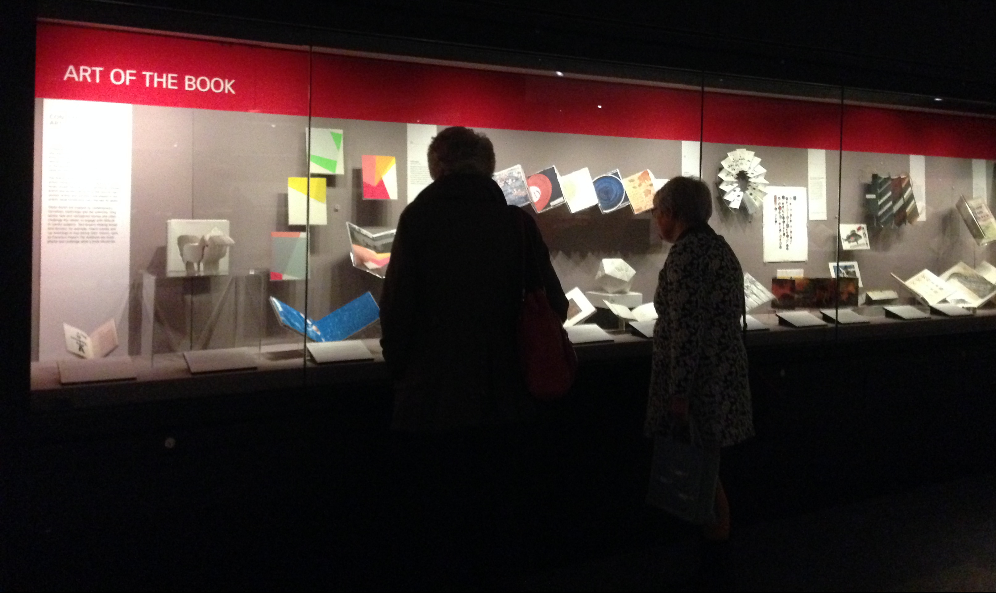
I’m very proud to say that another artist’s book of mine, Paper Wings, setting a cycle of 52 love poems by Maureen Duffy, has this spring been included in a new display of artist’s books by women for the Art of the Book exhibition cases in the British Library’s Treasures Gallery, alongside some of the rarest and most beautiful books and manuscripts in Britain. We’re very much looking forward to visiting Paper Wings in the Treasures Gallery with Maureen when the Library is able to open once more – and I think her hero Al would approve even though it’s in the new Library.

— | —
Conceptually, for me, books like The Round Reading Room made from a single sheet of paper, rippling out from, or circling in towards a central vortex are directly linked to my thrown pots; the circular structure, with its spiralling line is closely related to the upwardly spiralling form of the thrown bowl, and I like to set the text on bowls to map this form, rising on the torque of the wheel:

Sweet rain bowl
Tall bowl thrown on the wheel in white stoneware, with text lettered with a brush in underglaze oxides, and a clear glaze fired to 1265 degrees; 31cm high by 26cm diameter; poem Sweet rain by Frances Bingham.
This bowl is one of my all-time favourites. I very much enjoy throwing on the wheel in the summer, and I like to work up to large bowls towards the end of a day’s throwing, when I’m in a good flow, and the relaxed watery coolness of the throwing can be lifted with a certain restrained excitement – I find I’m holding my breath while lifting the clay walls for a tall bowl like this. And when the pot is turned and dried, it’s lovely to have such a large canvas to decorate. This poem by Frances suggested this tall form of the bowl to me, a shape that I now call a ‘water vessel’. I set the lettering pouring down the inside to the bowl’s heart, and then circling up around the outside to begin the unending cycle again:
Then the sweet rain
risen from wave-breath
falls on the hills again
sinks through the old rock
down into earth’s invisible vessel
To rise as the spring again
ever circling
always flowing
life giving
alive like love
Sweet rain, by Frances Bingham

(More on throwing and decorating large bowls and water vessels here.)
— | —
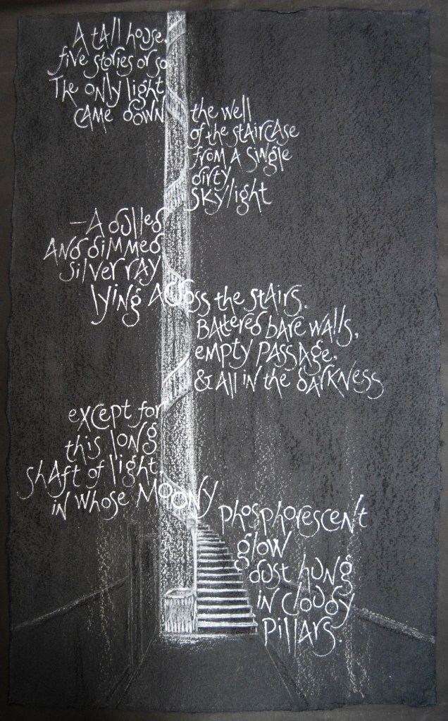
Light shaft
Paperwork on handmade paper 40cm x 70cm, with charcoal, chalks, and acrylics; text by Julia Strachey from her diary 21st July 1933
In July 1933 Julia Strachey went out for an illicit lunch with Wogan Philipps, at the beginning of their love affair, and afterwards they went to see a picture framer in Lambs Conduit Street to collect some frames. (Wogan Philipps aimed to become an artist and set up a studio in Paris – but this didn’t happen. He was married to writer Rosamund Lehmann at this point.) Julia says: ‘the shop was shut but an old woman let us hunt round for his frames’, and then describes this London interior – old fashioned even in 1933 – but intensely atmospheric. I wanted to catch something of the extremes of that atmosphere, romance and excitement mingled with the melancholy dust of the dingy house, the ‘moony phosphorescent glow’ lighting the dark interior – cantilevering the words around the architectural framework of the tall stairwell, using charcoal and chalk and a bit of raw clay-dust on black handmade paper to give a grainy effect to the dark interior scene, the air heavy with dust-motes. I particularly enjoy the rhythm of Julia’s words, and their incantatory dreamlike quality, but I do wonder if they ever found Wogan’s frames.
— | —

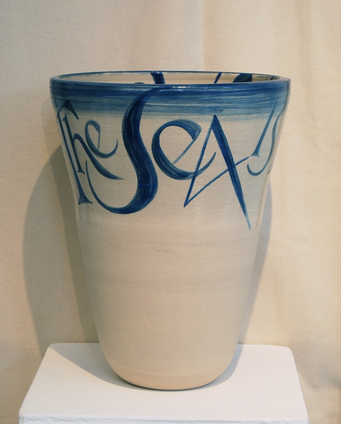
River – Sea bowl
Bowl thrown on the wheel in white stoneware, 36cm high x 27cm diameter, with underglaze oxides and a clear glaze fired to 1265 degrees; words by TS Eliot from Four Quartets.
Round the corner from Lamb’s Conduit Street, Faber & Faber’s independent publishing house began in Russell Square in the 1920’s, later moved to Queen Square and then in 2009 to Great Russell Street, just along the road from the British Museum. In TS Eliot’s time Faber were still here in Russell Square in a Georgian house on the south side. The Dry Salvages, the third poem in Eliot’s Four Quartets, with its themes of reconciliation of opposites was the inspiration for another in this group of water vessels, with the inscription:
The river is within us,
The sea is all about us.
Lettered with a brush in underglaze oxides, the river line spirals down inside the tall bowl, while the sea line wraps around it. I glazed the inside and the top half of the outside of the bowl with a clear glaze to give a watery effect, contrasting with the matt stony lower half. Much of my work is about containment, and the connection between the outer surface and the space within – either literally, or allusively, and for me, the text can always make that connection – sometimes by mapping the outer skin or wall to reveal the form within to the eye, sometimes by evoking that form for the imagination. Even in my house portraits I find that I’m studying the visual clues for elements of the house’s character in order to catch the likeness – reading the visible surface for what it reveals of the inner nature.
— | —

In Norfolk
Double-sided artist’s book on a single sheet of handmade paper, with watercolour and acrylics; words from Virginia Woolf’s Mrs Dalloway.
On a summer’s day a little further west in Mayfair, Richard Dalloway and Hugh Whitbread (in Virginia Woolf’s novel Mrs Dalloway) stand on the corner of Conduit Street after lunch with Lady Bruton, looking in at a shop window, not wishing to buy anything, wishing in fact to part – ‘only with contrary winds buffeting the street corner, with some sort of lapse in the tides of the body, two forces meeting in a swirl, morning and afternoon, they paused.’ Richard Dalloway is ‘half- thinking’ of Norfolk, the vision dreamily swirling in the air so that the windy London street corner transforms into a soft warm wind blowing on petals and waters, where haymakers rest at noon from their morning’s labours amid the rustle of the grasses and cow parsley trembling in the breeze, and we feel the ‘steadfast blazing summer sky’ in Norfolk that is actually shining down on the lunchtime London street corner.
I wanted to bring in this sense of duality, being in two places at once, the tension between the two aspects, so I set this text as a double-sided book on a sheet of blue paper, the words flowing round from one side to the other, swirling like the wind and ruffling the pages. The lettering is made with a sea-driftwood stick from a Norfolk beach, and my favourite wooden clothes-peg again.

(In Norfolk page-by-page here.)
— | —

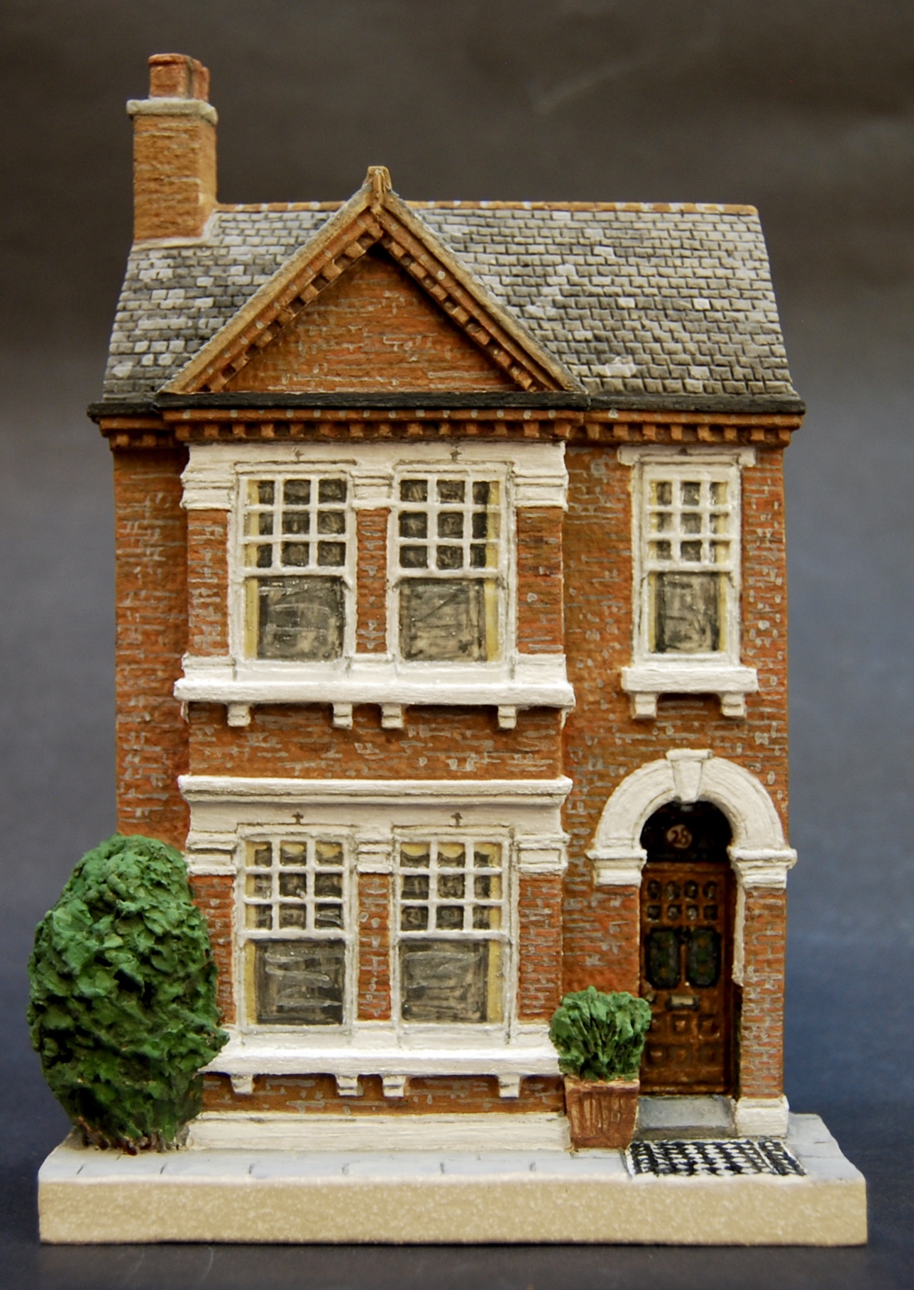
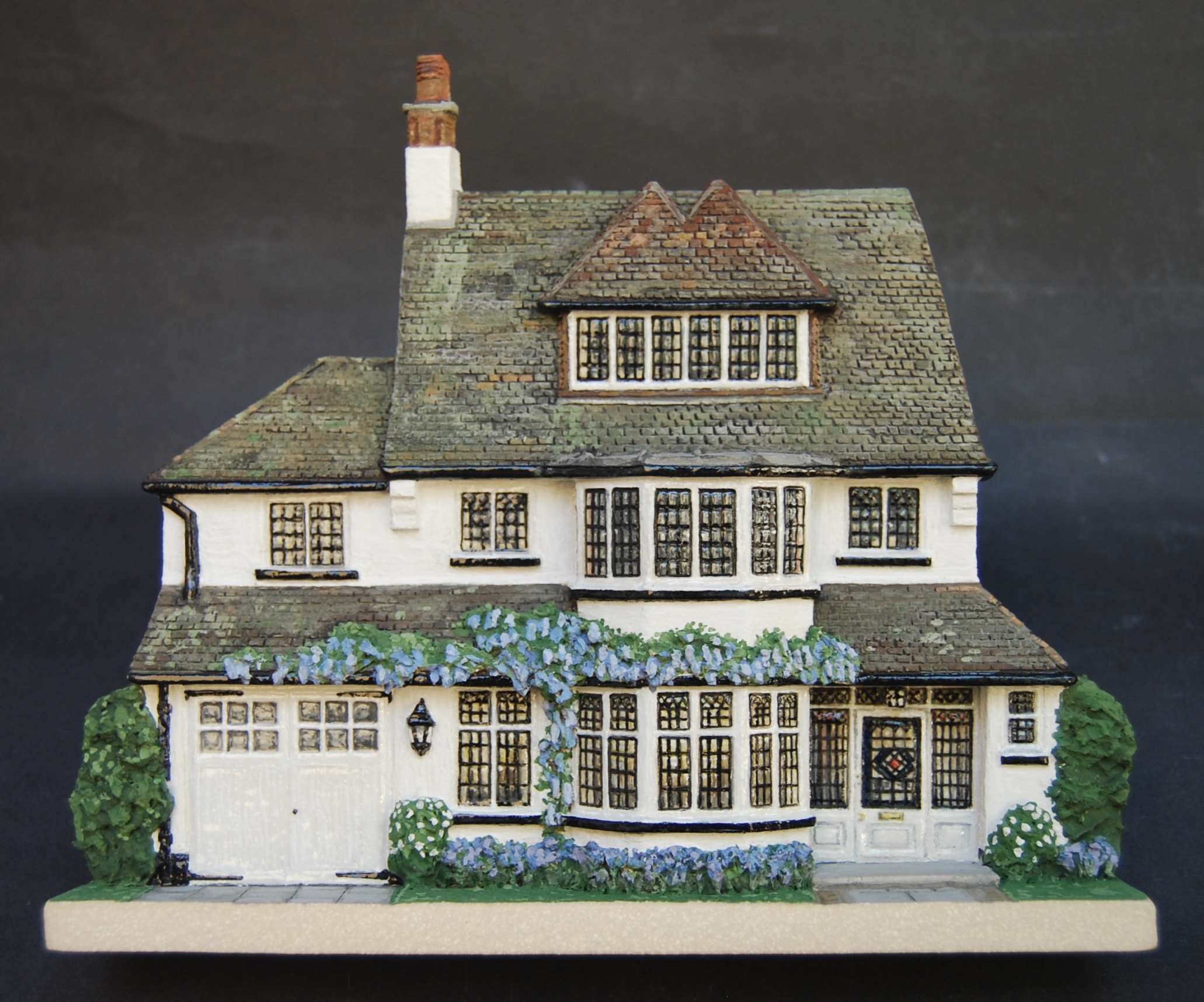
Three London Houses from a time-line
Architectural portraits in stoneware, with underglaze oxides and a clear glaze, fired to 1250 degrees; each inscribed and signed on the back.
A little further west we find these three London houses, neighbours in time, rather than space. One of my favourite commissions of 2019 was for a group of houses in a time-line, a family’s sequence of five homes from their earliest small London mews house to their present home in West Sussex – and three of them were these London houses. I made the group together in proportion, first drawing each house from archive photos, and then talking with the family about their memories of the houses, what they were growing in the garden or window boxes, what colour the glass in the windows was, so as to build into the portrait memories that can’t be photographed, deeper than the merely visible. Each house was inscribed on the back with the names of family members who lived there – so the growing family was recorded along the timeline of their homes. These three are each very characterful, individual houses, and somehow also convey the character of their London ‘villages’ – the smart but simple Chelsea mews, the Victorian terraced house with its lovely brick detailing, woodwork and tiled path, the elegant black and white Edwardian family house with its Arts and Crafts irregularities and beautiful wisteria.
(More on house portrait commissions here.)
— | —
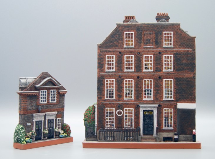
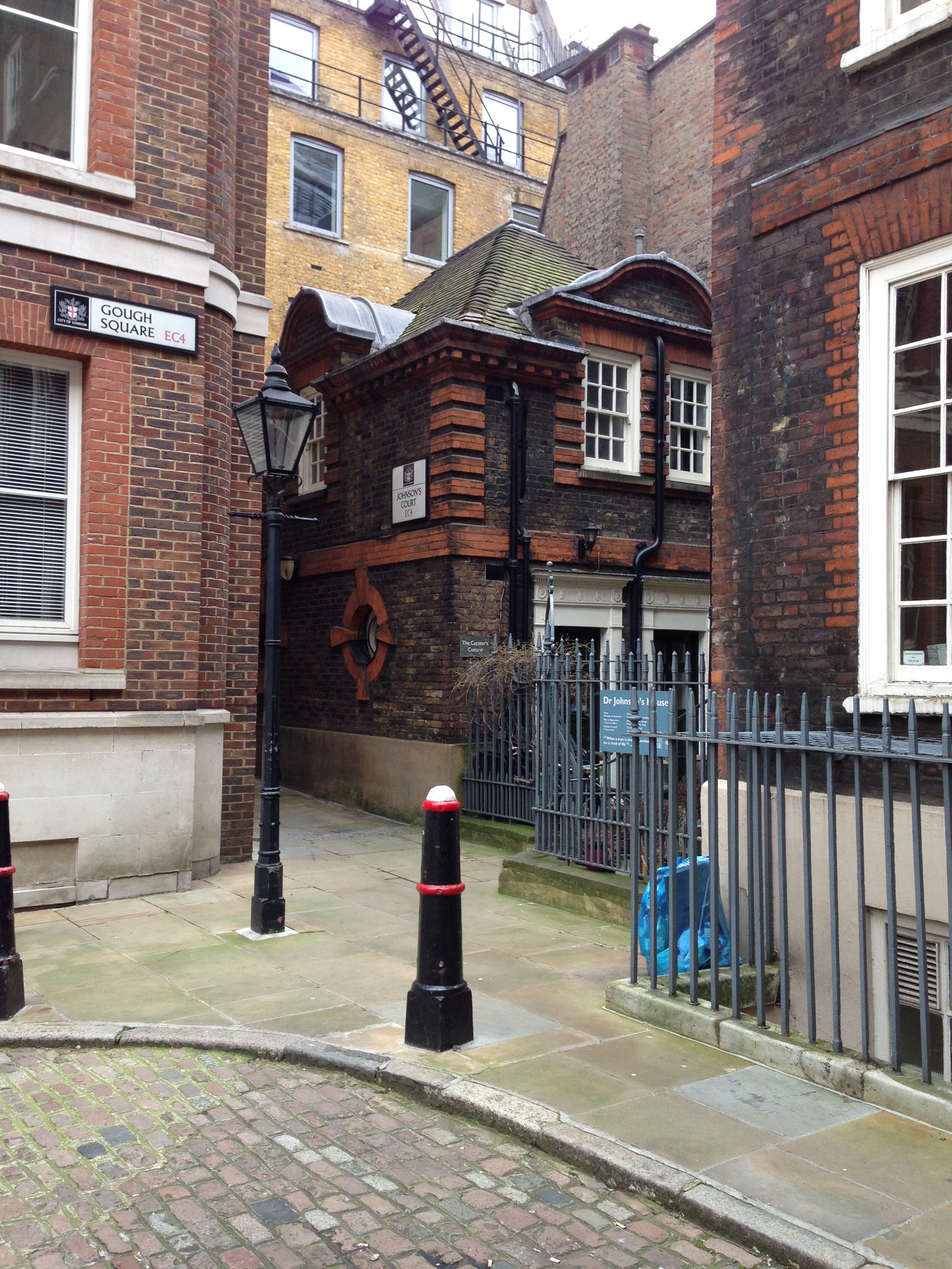
Studies for Dr Johnson’s House, and the Curator’s Cottage
Working drawings on graph paper in pencil, for portraits in terracotta.
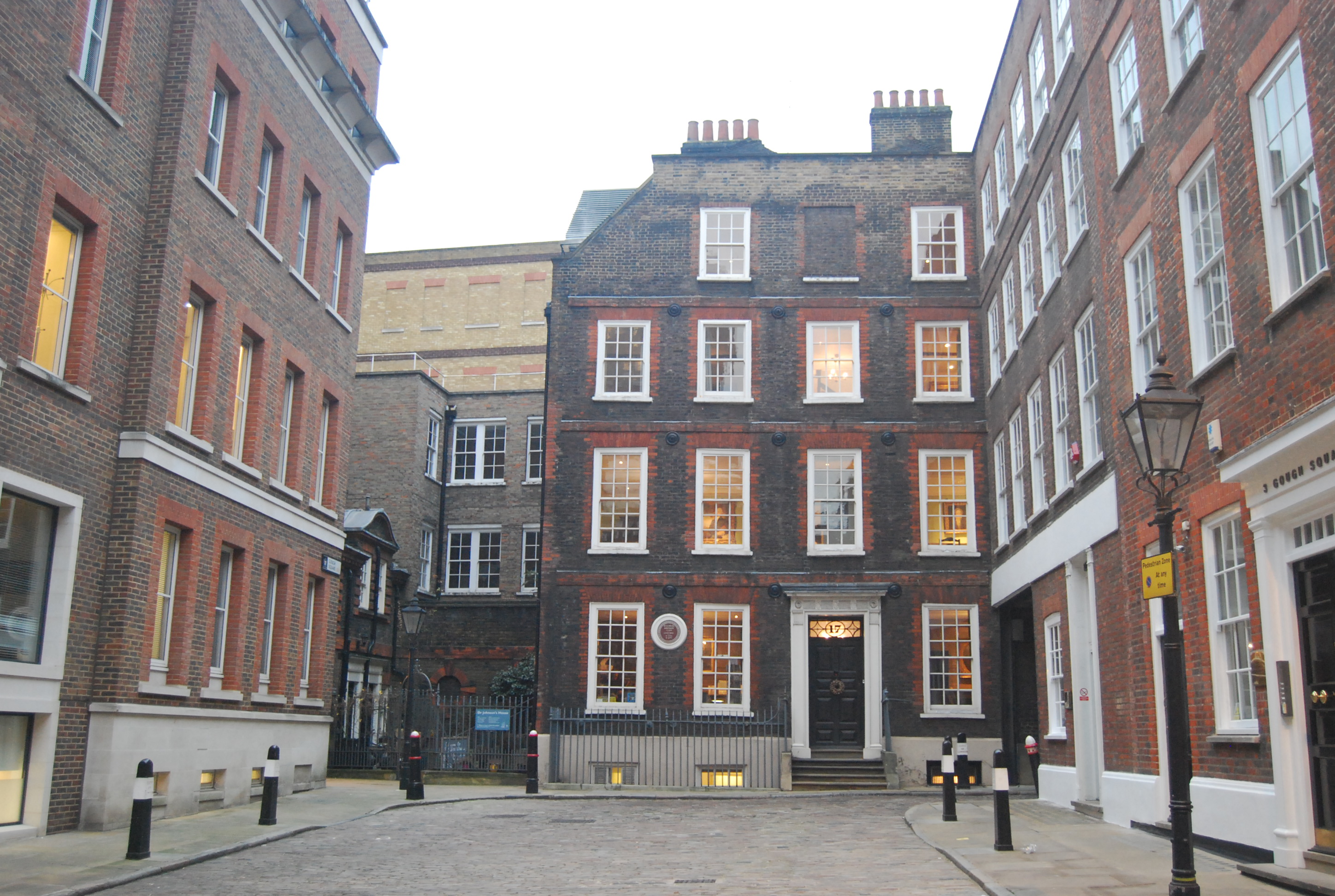
Back eastward a little into the historic City of London, we find Dr Johnson’s House tucked in among a maze of courts and alleyways. Here is another house of books, home and workplace for the great lexicographer (Johnson’s Dictionary definition of ‘Lexicographer: a writer of dictionaries, a harmless drudge’) through the middle decades of the eighteenth century, with its interior restored and with a wealth of original features. Here in his home, his Dictionary of the English Language lies open at the word ‘traveller’:

but the atmosphere of the house underlines his conviction that
‘To be happy at home is the ultimate result of all ambition.’
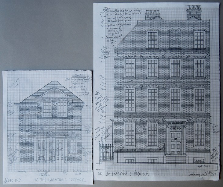
Here are my working drawings for a portrait of Dr Johnson’s house, and its charming tiny Curator’s Cottage next door; I think the lines on paper themselves seem to catch something of the literary atmosphere, the house full of papers, the clarity and modesty of its Georgian design. To see Dr Johnson’s House at dusk on a wintry afternoon in the City, with its clear glass windows warm with lamplight, is to see the very picture of rational comfort and enlightenment combined – ideal qualities in a happy home.
This portrait with its attendant Curator’s Cottage has been a work in progress and I’ve only just decided on its final form, having considered it for years. The five storey house itself is an excellent subject, with its beautifully articulated facade and elegant windows and door-case, but for the fact that it stands on the north side of Gough Square, and extends eastwards (to the right of this drawing) into the corner of the range of buildings that form the east flank of the square, with that continuation of the house’s wall being internal except for the ground floor section which forms the side wall of the alley:

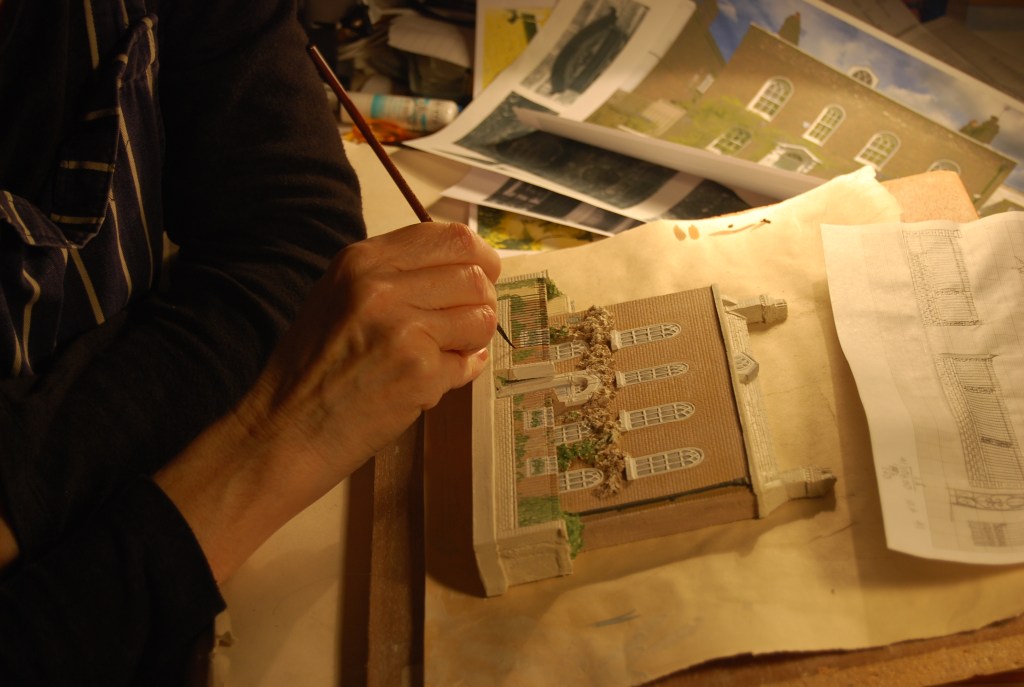
And the cottage, tucked into a tiny courtyard to the left of the house, and now dwarfed by surrounding offices, stands at right angles to the house, looking towards it as though keeping an eye on it and waiting to serve it in some way – so a clay portrait in low-relief of the two together is a challenge. This shows one of the difficulties with making portraits in low relief: they are not 3-dimensional models – rather they are the view of the subject from the human perspective, not the bird’s eye view which gives an excellent roof-scape but little else, and any building or group of buildings that needs to be seen from several angles usually requires a group of portraits. I’ve often made studies of a house from several different angles, showing the different character of different faces, and now and again I’ve made a house portrait at an oblique angle – but it’s not always possible to get the clay to do this, due to the resulting extreme variations in thickness in the clay of the portrait. However, I do love a challenge, and it seems appropriate that a portrait of Dr Johnson’s House should involve a lot of thought.
I eventually decided that the portrait of the house should include the otherwise hidden right hand section of wall tucked into the corner, the wall that exists though invisibly except for its ground floor section; and to make the Curator’s Cottage separately, to stand in attendance on the master house. The red camellia growing in the courtyard between the two links the two portraits, as does the scale, and the charming repetition of features and details from the big house to the small, like the smaller versions of the main front door case on its little brother, and the brickwork detail. I like the feeling in the portraits of the focus of the big house being all interior, with some of the contents (portraits, library, lamps) being visible through the lighted windows, in contrast to the attendant cottage, where the focus is all exterior, looking out towards the big house.


(Dr Johnson’s House is a member of the Small Historic Houses of London group.)
— | —

Whitechapel Pottery
Architectural portrait in stoneware 11cm x 22cm, with underglaze oxides and a clear glaze on windows and gloss paintwork. Inscribed and signed on reverse.
A little further east in Whitechapel, in a small lane next to the Royal London Hospital our third pottery had its street-front. It was such an interesting place: the narrow gallery backed onto a Victorian warehouse where we lived and worked – one huge room 90′ long, so really only the ground floor of this portrait shows our work and home – and I took some liberties with the appearance of our neighbours’ flats upstairs – the prettily tended window boxes are a cosmetic figment of my imagination, I confess – but it’s a nice thought.
With commissions, I’m sometimes asked to do a tidying up job – prune the climbers back a bit or repaint the front door for the portrait. But often people want the most accurate record, warts and all – showing scars in brickwork from rebuilding, or restoration of stonework – and occasionally I’ve made a portrait of a romantic ruin, with all its dilapidations meticulously depicted. Our Whitechapel gallery did have the nice traditional wooden shop-front that I’ve shown, and I recorded the rest of the structure accurately, so I think I can be forgiven for the flight of fancy in the flowery window boxes. The gallery was long and thin, originally a carriageway to bring in cartloads of timber to be cut in the warehouse behind; and it certainly made a good gallery for pots – some of which can be seen in the shop window here.
And this, just for the record, is our pottery number 2, in Wisbech, Cambridgeshire:

We restored this tumble-down brick stable at the bottom of our walled garden, which backed on to a little mews-lane. Young and enthusiastic, we built walls, repaired the roof (repeatedly), put in doors and windows, repointed, laid timber and tiled floors, installed electricity and a wonderful old wood-burning stove reclaimed from a village hall (The Tortoise), and made a quirky little gallery that was much visited, even by people coming up from London for a day out in the Fens. We were there for seven years before moving back to London in 1996 to open the Whitechapel Pottery, where we stayed for ten years before our move to Potters’ Yard in 2006.
— | —
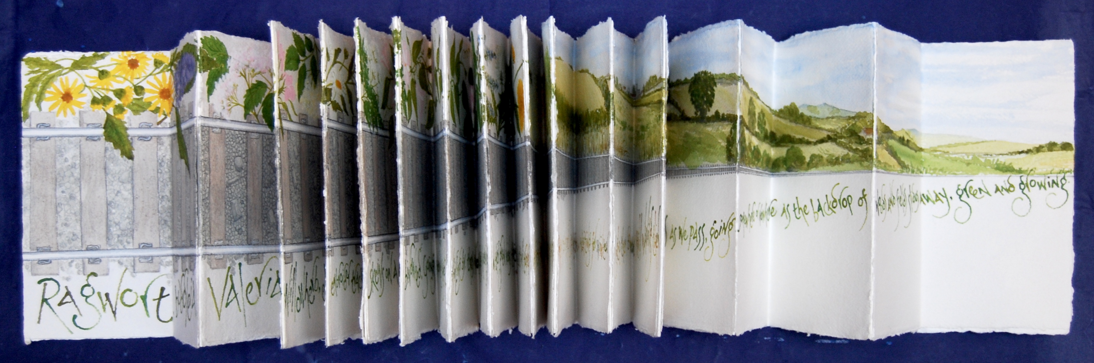
Trackside
Artist’s book on 28 sheets of handmade paper each 21cm x 21cm, in concertina form; poem Trackside by Maureen Duffy; watercolour and acrylics, text lettered with a driftwood stick.
After that little diversion into East Anglia, we’re now only a little further east from Whitechapel with this artist’s book. When Maureen Duffy read her poem Trackside at the launch of her latest collection, she told the story of its inspiration on a train journey out of London’s Liverpool Street Station, eastwards along the river to Southend, to visit her cousin – and as she read the poem, we in the audience could see the grime of station and sidings and East End give way gradually to the ‘backdrop of woods and fields… green and growing’. I found this poem irresistibly inspiring for an artist’s book, with the steadily diminishing railway tracks providing a design framework to draw the narrative through the pages – one long line, all the way to Southend – and details of the view, close up and far, following the text. I think of books like this as contemporary illuminated manuscripts – and perhaps they can serve the same function as the medieval ones did – and still do – as objects of contemplation that connect us with spiritual truths behind the everyday.
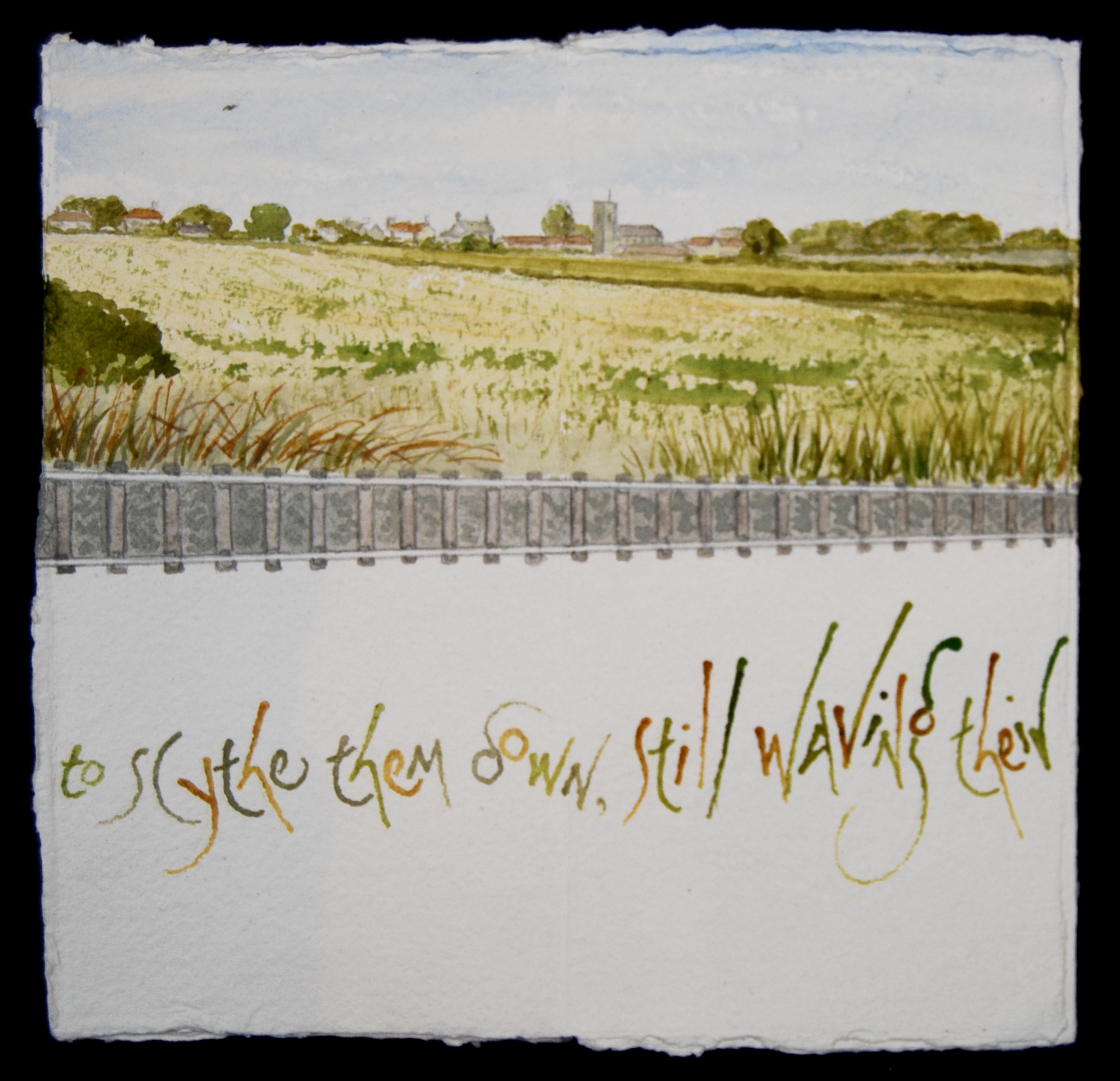

(To see Trackside page-by-page, click here.)
— | —

The Lost Language of London
Paperwork 42cm x 30cm with acrylics mixed with Thames water; text from Maureen Duffy’s Mother Tongue, lettered with a Thames driftwood stick.
This paperwork is one of the illustrations for Maureen Duffy’s latest poetry collection Wanderer, a lament for the multi-coloured phrases and idiom of her East London childhood and youth and a plea for the imaginative brightness of this linguistic diversity:
‘So let me hear creole, chi-chi, slav weaving
themselves into our common tongue and
daubing it with all the palette of the world
until it starts out again from the frame
vibrant, many coloured as the fruits
and faces of London’s market stalls.’

— | —
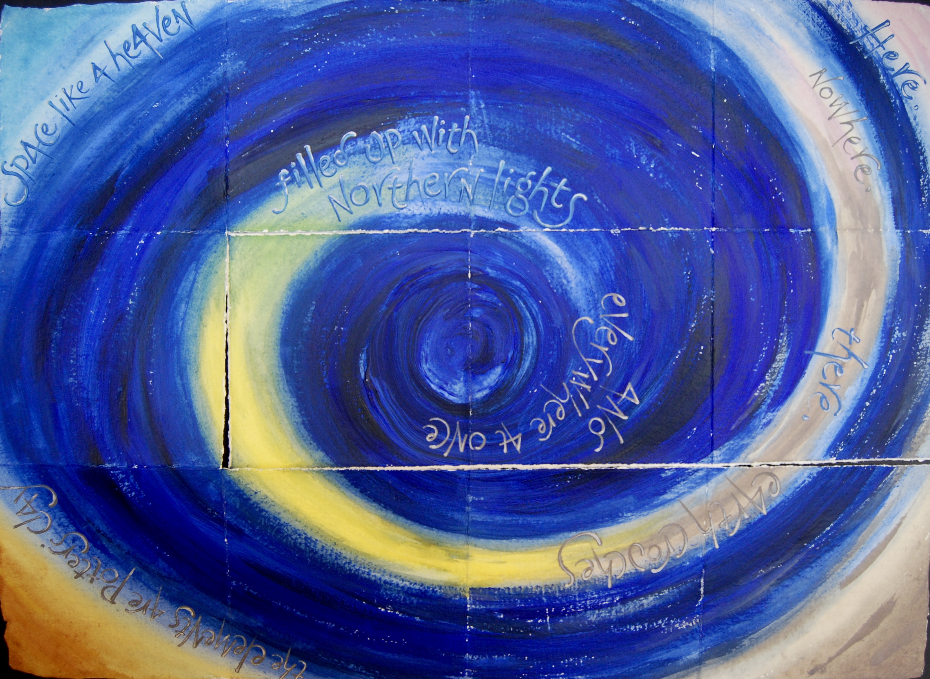
Heavenlight
Artist’s book made from single sheet of handmade paper 70cm x 50cm, painted, folded and torn into a sequence of pages; acrylics and raw stoneware clay slip; text from Wordsworth’s Prelude V, lettered with a Thames driftwood stick.
Now we’ve reached the river, you’ll probably expect a setting of Wordsworth’s Upon Westminster Bridge, one of the poems I learned by heart when I was about 12 at school (and can still recite at need, including punctuation). But it’s late in the day, not sunrise, and so instead I’ve chosen this artist’s book, which I made after seeing a particularly vivid sunset/light display from the balcony of the Upper Circle bar in the National Theatre, looking northwards over and above Waterloo Bridge. We had no camera with us, no phone, only eyes to record the sight, and in my memory it was a great swirl of blues and pinks and gold and violet, with little flashes of a turquoise green and some straggling pinky grey clouds. I’ve never seen the true Northern Lights, except in photos and cruise adverts, but reading Wordsworth’s poem brought this swirling sunset to mind, and his line ‘the elements are potter’s clay’ made the setting irresistible to me.
(Heavenlight page-by-page here.)
— | —
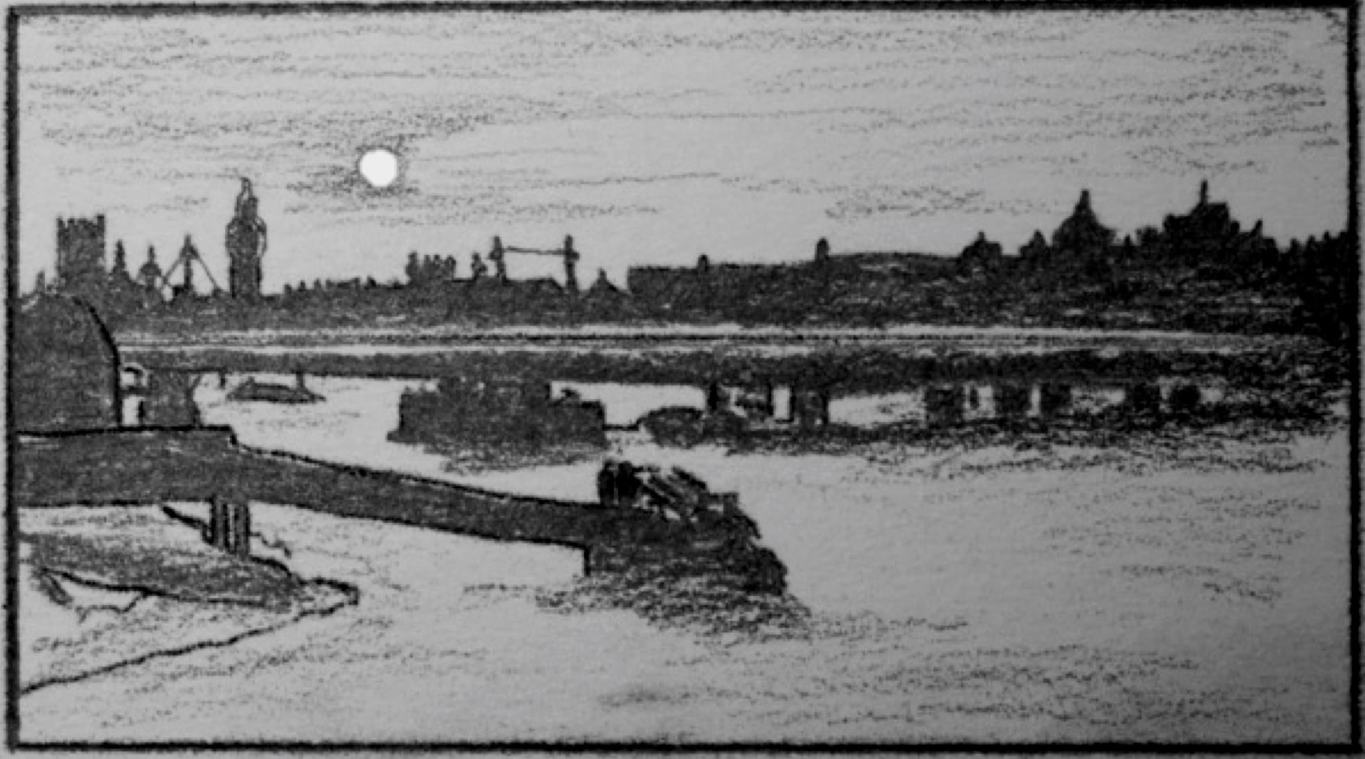
Waterloo Bridge: Panufnik (1943)
Drawing in pencil and ink on cartridge paper for book illustration, for London Panopticon by Frances Bingham (The Pottery Press 2020)
While we’re here at Waterloo Bridge, I’m going to jump ahead to the last exhibit, drawings for London Panopticon by Frances Bingham. I was lucky to collaborate with Frances on this book, making the inter-title drawings and designing the book, and this drawing is for a meditative story inspired by hearing the Polish composer Andrzej Panufnik’s daughter (also a composer) Roxana Panufnik talking about her father’s time in London during the war in a Proms interval talk a couple of years ago for his centenary.
(To read Frances Bingham’s story, Waterloo Bridge: Panufnik (1943), click here.)
— | —

Vision of the Floating City
Paperwork on handmade paper 70cm x 50cm; words by Maureen Duffy from Alchemy 2004; painted with watercolour mixed with Thames water, and lettered with driftwood sticks from the Thames.
Here we’re back in company with Maureen Duffy, scribe of London and modern-day troubadour, looking across the river from the Strand side to the South Bank, for a nocturne in blue and silver. I love the way the dreamlike quality of the words imbues the rather solid architecture with visionary character, romance and yearning, as the city gazes at its floodlit self in the dark waters of the river like Narcissus. I made this painting with watercolour and acrylic paints mixed with Thames water, and lettered it with a driftwood stick picked up one mudlarking afternoon, down by the Festival Hall, so that the river itself has a material presence in the painting. The river-line was painted with one stroke of the brush, and the paint for the lettering is mixed with a little grey stoneware-slip, giving body to the grey stone buildings.
— | —
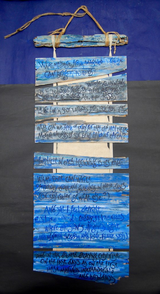
Blake’s Graffiti
Banner book with pages made from pieces of wine-box, handmade paper, linen tape and acrylics; lines from Kathleen Raine’s What Message from Imagined Paradise.
Every time we go mudlarking down by the river, we find all sorts of treasures – the stems of clay pipes of course, but also beautiful river-carved, evil-smelling planks of wood which shrink to splinters as they dry. I often use driftwood sticks as lettering tools in my books, and this banner book has pages made from jetsam – a broken wooden wine case that we found on the Thames foreshore down by London’s Southbank Centre – sadly empty. I made another painting on the lid, and for this banner book, painted the crushed box sides and bound them roughly together with handmade paper and linen tapes, then lettered them with Kathleen Raine’s poem, asking:
What can we hope or pray for that can heal these
Mortal wounds of our brief beloved earth?
and reminding us that today’s blue skies do still bring delight, light and warmth, (‘wisdom and love, Blake says’), but that we really must do something now about the mortal wounds, before it’s too late.
— | —


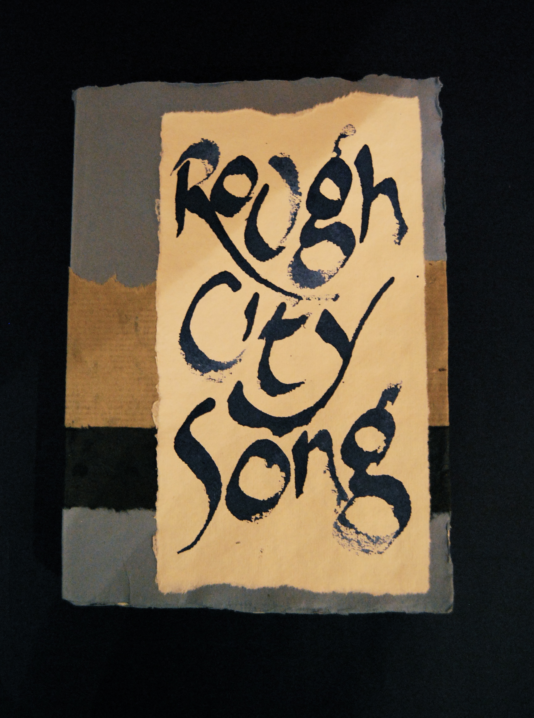
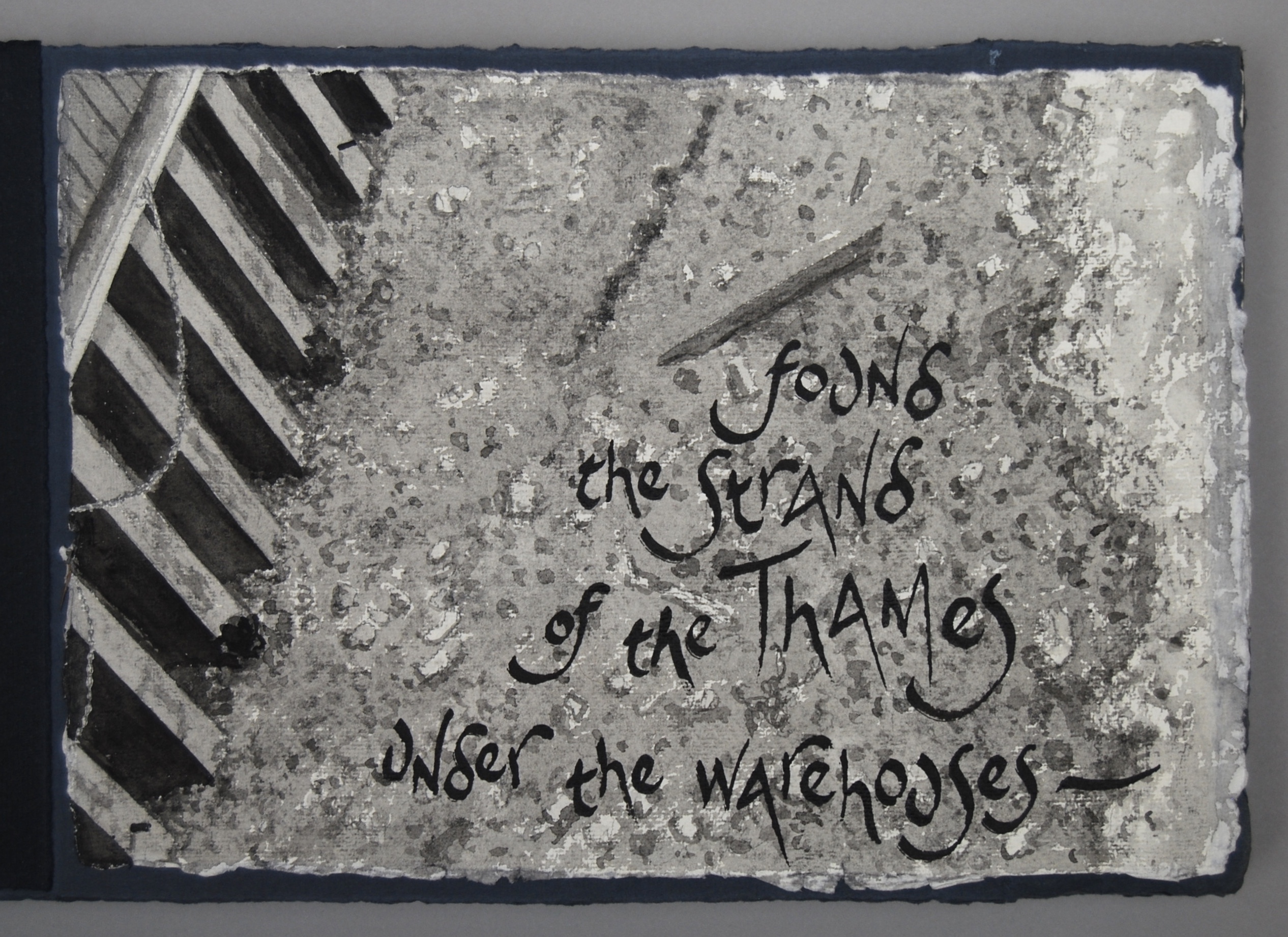
Rough city song
Artist’s book on handmade papers, with acrylics, fully opened 210 cm long x 21 high; lines by Virginia Woolf from The Docks of London in The London Scene, one of six essays for Good Housekeeping 1931.
This was one of my early artist’s books, and a favourite, with the riverside London scene made from torn shards of handmade papers, and a quirky collection of little ships. It’s quite closely related to my monumental artist’s book Thames to Dunkirk, now the largest book in the British Library’s permanent collection, though it’s much smaller. Thames to Dunkirk opens out to a free-standing paper sculpture 17 metres long and a metre high, with a map of the Thames from source to sea along one of its sides, and a watercolour of the Dunkirk beaches on the other side. The two texts I set on it are by BG Bonallack – a first-hand account of the evacuation of Dunkirk in 1940 in typescript – and Virginia Woolf’s reflective undercurrent running beneath, in lines from The Waves.


Rough city song also has a text by Virginia Woolf – perhaps I could almost call it an incantation:
Here growls and grumbles that rough city song that has called the ships from the sea and brought them to lie captive beneath its warehouses.
These words were written for The Docks of London, the first of a collection of six incandescent essays Woolf wrote called The London Scene for Good Housekeeping magazine in 1931 – a prime example of the concept that ‘if a job’s worth doing, it’s worth doing well’. This inscription too was lettered with a Thames driftwood stick, in paint mixed with Thames water. I took many of the ideas from this setting on to later books, and some of the techniques too; I wouldn’t make it in exactly the same way now, but I like how its rough freshness and uncomplicated construction reflect the words.
— | —

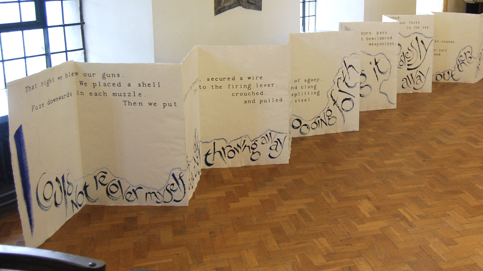
Thames to Dunkirk – the working model
Page 10 (The London Page) from working model for a large-scale artist’s book now in the British Library; page of handmade paper 42cm x 30cm, with watercolour and acrylics, lettered with a brush and with a driftwood stick from the Thames; texts by BG Bonallack and Virginia Woolf.
The sheer scale of the full-size book Thames to Dunkirk at 17 metres long necessitated a working model, akin to my working drawings for the portraits, in that it helped me establish the proportions, the composition and the continuity, and revealed many issues of construction that I was glad to sort out before the construction of the big book. The working model is only about 5 metres long when fully opened, compared to the 17 metres of the big book, but it’s made in exactly the same way – 24 sheets of handmade paper constructed as a double-sided concertina book, following the line of the Thames from source to sea along the first side, with the names of the little ships that went to the rescue at Dunkirk in 1940 lettered along the river line, and on the other side, a watercolour of the 15 km of beaches and dunes either side of Dunkirk town where the great mass of 300,000-odd soldiers gathered for the evacuation, with many of their names lettered in the crowds and queues of men.
Thames to Dunkirk was acquired by the British Library in 2010, the 70th anniversary of Dunkirk 1940, and was shown in their major exhibition for 2012, Writing Britain. This year, 2020, sees the 80th anniversary, from 26th May to 4th June – and plans for events to mark the moment at the British Library had to be put on hold. But an article by me on the BL’s blog went live on 26th May, with a new film of Thames to Dunkirk, and a new edition of The Dunkirk Project shares some more moving stories from Dunkirk 1940, as well as looking at some of the other works of art it has inspired. And I’m in the process of making, one-by-one, copies for a handmade half-size facsimile edition of this working model at 1/32nd of the size of the big book. Its pages are 30cm x 21cm, made from photographs of the working model’s pages, and it’s constructed in exactly the same way as the working model and the big book, each copy signed and numbered in a limited edition of 50.
(For more on Thames to Dunkirk at the British Library, click here.)
— | —

32 bar blues
Banner-scroll book 160cm long by 77cm wide, made from 32 bars of stoneware clay lettered with underglaze oxides, cotton duck canvas, silk and wool threads, string and yarns, copper pipes and driftwood with birch sticks, acrylic paints and Thames water; poem A Melancholy River by Richard Price.
I first saw this poem by Richard Price in the TLS – laid out in just the same arrangement as the words are set here on the 32 clay strips of the title. For the setting, I wanted to retain the spacious, slow-flowing melancholy rhythm of the words in the soft watery feel and the colours of this banner book, which rolls up into its binding to close – though you probably wouldn’t want to carry it in your pocket on an afternoon’s boating on the river, as it’s nearly as heavy as Thames to Dunkirk. The bars of clay were cut, dried, decorated by brush with underglaze oxides, fired, glazed and fired again, then stitched and woven into the ‘river’ of painted canvas and woven threads, hung from a long river carved piece of driftwood and some reclaimed copper pipes.
— | —
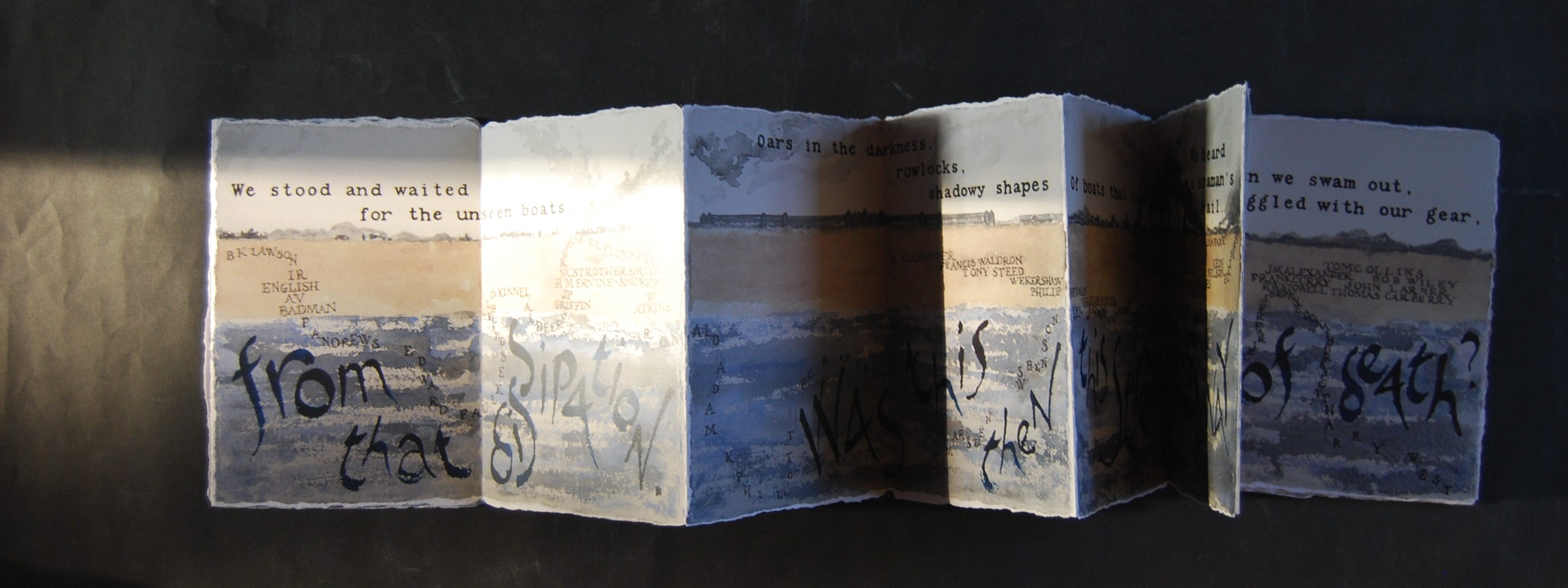
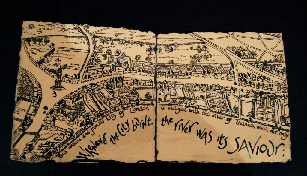
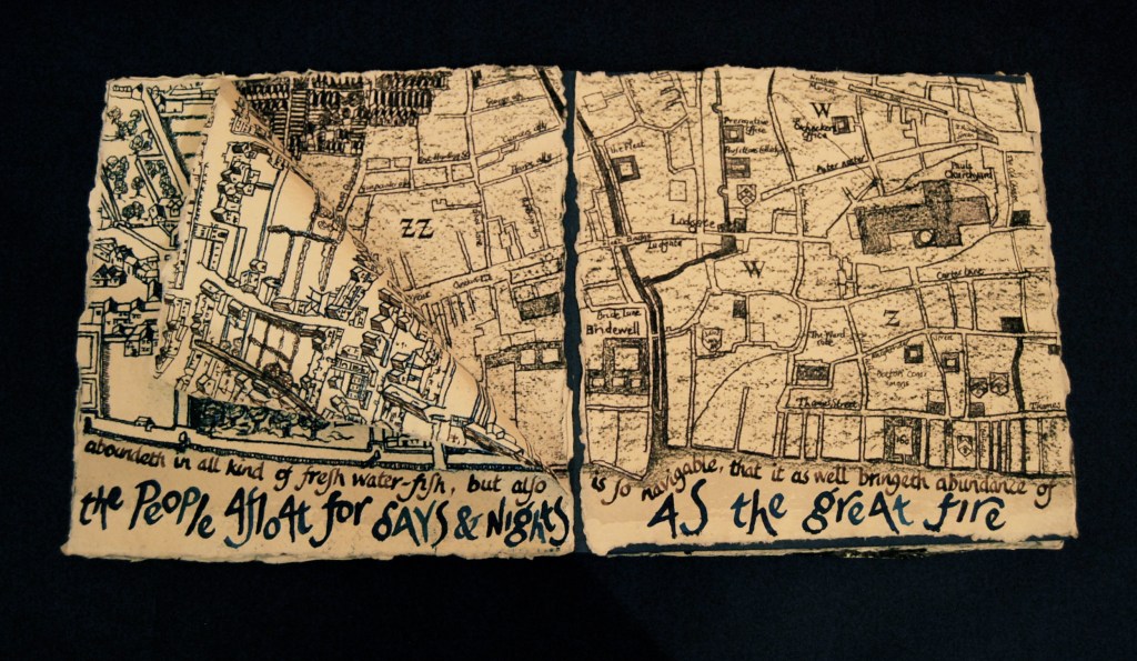
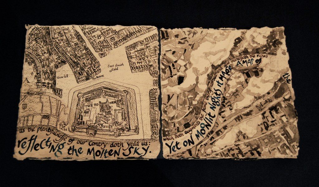
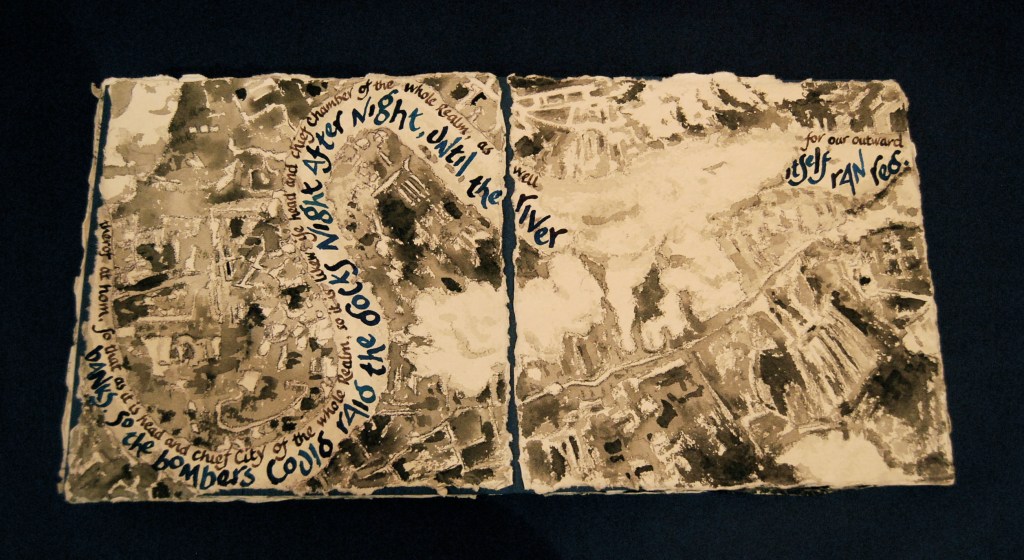
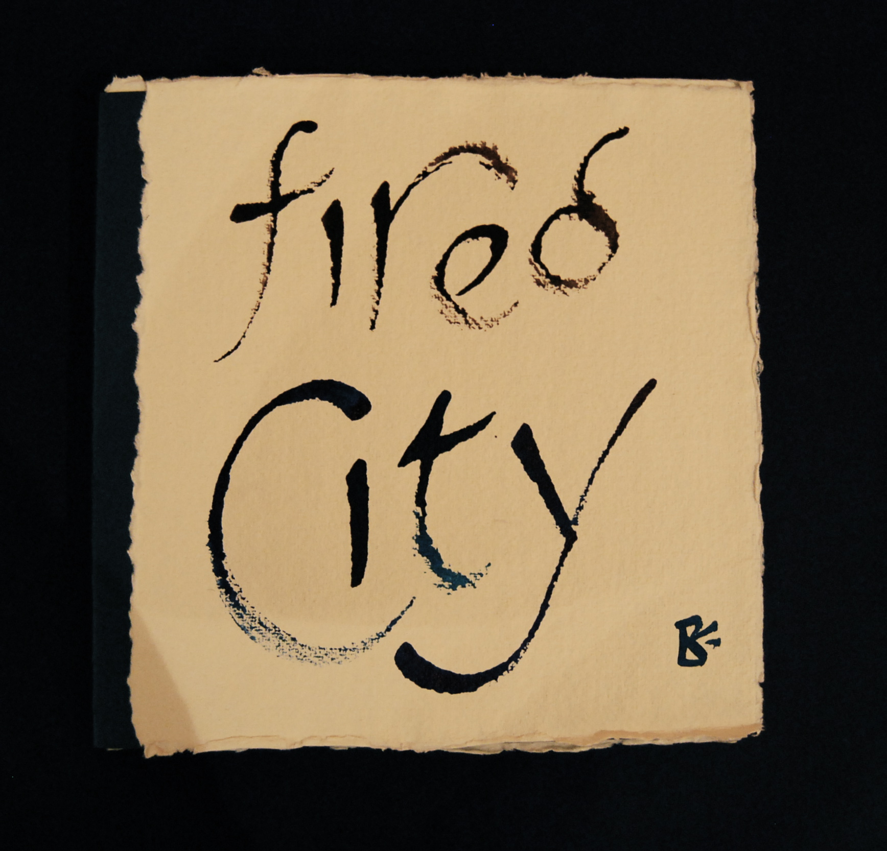
Fired City
Artist’s book made with 14 sheets of handmade paper each 21cm x 21cm; acrylic paints and inks; texts from RiverSoup by Frances Bingham, and ‘Agas’ map of 1560’s; maps drawn from the ‘Agas’ map 1560’s, Hollar’s ‘Exact Surveigh’ of London 1666, and Luftwaffe photographs from 1940.
This book takes a trip down river through time and space. RiverSoup is an artist’s film that Frances and I made together – her words, my images – following the Thames from the Pool of London down to the estuary, and this part of the film-script links the Great Fire of 1666 with the Blitz in 1940. For this artist’s book, I set her words running along the river within a continuous map of London, beginning in the 16th century’s ‘antient and famous City of London’ and the gardens and great highways of the West End (from the ‘Agas’ map of the 1560’s), on through the devastated City burned by the Great Fire as far as the Tower (from Wenceslas Hollar’s ‘Surveigh’ of 1666), out to the heavily bombed wartime East End and the Isle of Dogs (from Luftwaffe photos of 1940).
I’ve juxtaposed the words from the film-script with the caption from the ‘Agas’ map’s escutcheon celebrating the ‘abundance of commodities’ and ‘plentifulnesse’ of fresh water-fish that the river of Thames provides. I drew the maps from successive times, layering the physical appearance as well as the texts, with the devastation of the Great Fire revealed by Hollar’s ‘Exact Surveigh’, completed soon after the disaster in 1666 to record the damage for the great re-building effort that was to come, and the devastation of the Blitz revealed by photos taken by the Luftwaffe in 1940, also to record the extent of the damage, but for a slightly different reason.


— | —
Crossing Blackfriars Bridge
Artist’s book made from a single sheet of handmade paper 42cm x 30cm, painted, folded and torn into a sequence of six pages; text by Virginia Woolf from The Years; watercolour mixed with Thames water, lettered with a driftwood stick from the Thames.
Here is Virginia Woolf stepping out over Blackfriars Bridge, pausing in one of its little alcoves to look down on the water. In this artist’s book, again, the watercolour paint is mixed with Thames water to draw the presence of the river into the painting. I folded the sheet into its pages first, and then painted the moon with some iridescent acrylic paint mixed with Titanium white, and then brought the swirl of silvery blues for the moon moonlit water gradually out to the deckle edges of the sheet. When the painting was dry, I lettered the words with my favourite Thames driftwood stick, high-lit the letters in places, and then when all was dry, tore the sheet into the page sequence. Sometimes when I’m painting like this, I like to load the brush with river water, and dip it briefly in the paint colours, then allow it to flood out over the paper where it will. I don’t want to control it too much, and I love it when this kind of watery effect happens of its own accord.
(Crossing Blackfriars Bridge page-by-page here.)
— | —

RUS IN URBE at Gabriel’s Wharf
Architectural portrait in terracotta, 17cm x 12cm x 3cm, with underglaze oxides and a clear glaze.
Just along the South Bank from Blackfriars Bridge lies Gabriel’s Wharf, a waterside haven for artists and craftspeople (and some nice restaurants) in the Coin Street local development association’s first big project. We had a small gallery-shop there in the spring of 1995, while we were still at our second pottery (Wisbech Pottery). We had a show at Gabriel’s Wharf called RUS IN URBE, bringing to town from our country pottery a collection of flower-strewn meadow pots, wine jugs and fruit bowls, vegetable and herb bowls, and some house portraits. The shop sign on the fascia is my potter’s mark, and I painted the lettering on the window – the poster in the door gives the date of the exhibition. It was a joy to be back in town for a month, and we sold lots of pots – I remember one happy moment when two customers nearly came to blows over a garlic bowl:
‘I’m sorry, but I saw it first.’
‘Well, you should have picked it up then. I’m sorry, but I’m buying this one.’
‘I think you’ll find you’re wrong.’
– until we intervened and took a commission for another garlic bowl.
So this little portrait is full of memories for us; I like to think that all my portrait commissions, from the grand National Trust house to the simple shop front, can be a container of happy memories like this.
— | —


Strand of the Thames
Artist’s book made from handmade papers, digital prints and acid-free photo mounts in an edition of 20, from an original in the British Library. Text by Virginia Woolf from her diary 1939.
For this artist’s book, we followed in the footsteps of a walk that Virginia Woolf took along the foreshore of the Thames, bravely clambering down some rickety steps and exploring the riverside beaches. I made grisaille watercolours along the route, on handmade paper with Thames water to mix the watercolours, and constructed these into a 1940’s style photo album. This book is now in the British Library’s permanent collection, along with one from this edition of quarter-size facsimiles that I’ll be showing at Burgh House – a signed and numbered edition of 20, in which photos of the watercolours are made into an album in the same way, mounted with acid-free photo corners.


(Strand of the Thames page-by-page here.)
— | —
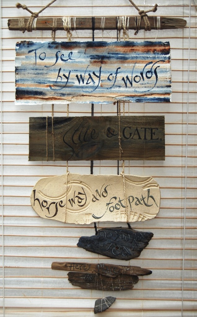
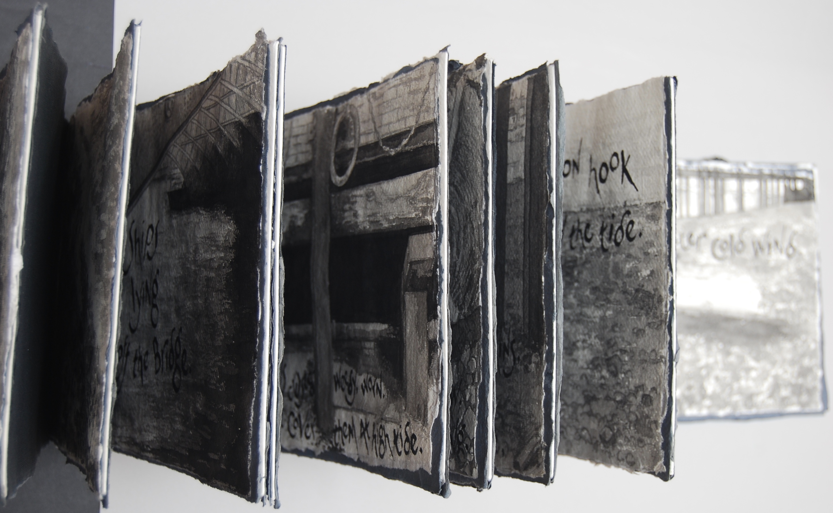
By way of words
Banner book with pages made from handmade paper, reclaimed timber, stoneware clay, sea and river driftwood, and a slate shard, bound with flax rope, cotton string, marine twine and linen thread; words by Jeremy Hooker from City Walking I.
Sixty-five years later, another Thames walker-poet, Jeremy Hooker wrote his extended poem-sequences City Walking I and II recording London walks with friends, on the streets of Paddington, between Edgware Road and Liverpool Street, into the City and across the river, then eastwards along the riverside path, where ‘The brown Thames laps against timbers’, and ‘Ebb tide reveals where London has crumbled.’ He observes the strata of ‘things once animate with use’, like the bits of wire and the button hook that Virginia Woolf sees on the foreshore, the ‘brick, plastic, iron, rope, wire; / granite sets of a causeway, / ground down, washing away. / London on London / sunk in Thames mud.’
And then, ‘walking between the New Globe / and the river’ brings his thoughts to Shakespeare, to King Lear led by his unrecognised son Edgar on the Dover Road, and ‘the cliff / which Edgar built of words, / and his father’s leap, / down, / down…’
The poet in his turn conjures for us in words that leap of the imagination:
To see
by way of words.
Stile and gate,
horse way and foot path.
Do you hear the sea?
Here’s the place.
(from City Walking I by Jeremy Hooker)

In this banner-book, I’ve set the words on pages of appropriate materials, steadily narrowing to a point: first, handmade paper, then a timber plank from a gate, then chalk-white clay for the stony path, with imprints of horseshoe and walking boot, then a small driftwood wave carved by the sea, then scraps of river driftwood bound together with linen thread, including the stick I used for a pen on the first page, and lastly, a small slate shard like an arrowhead. The symbolism of the materials, all they stand for, is readily encompassed by the words – and the banner-book embodies the specific-ness of the words in the materials they conjure for us, bringing the lines full circle.
— | —

Drawings for London Panopticon – London Bridge
Drawings in pencil and map in coloured inks and pencils for paperback book with text by Frances Bingham and images by Liz Mathews, published by The Pottery Press February 2020
London Panopticon begins here where this tour ends, on the south side of the river along by London Bridge at high tide, about four o’clock in the morning. Blue, a London guide, walks a pilgrimage through time and the city, up to the heights of Hampstead Heath with its twilight view down over the city – and ends with another curious journey. And so this tour comes full circle. I drew a series of pencil drawings for the book’s chapter-heads, inspired by one of my favourite illustrated London books, Walter Jarrold’s London of 1925, with Ernest Haslehurst’s paintings and Robert Lee’s black and white title-drawings. Here, the original pencil drawings are mounted on handmade paper with the book’s hand-drawn map.
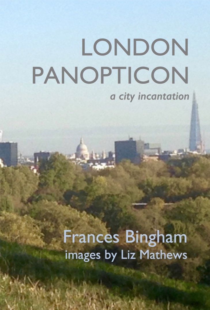

The Pottery Press is our own micro-press here at Potters’ Yard. For more information on this book and our full list, please see our website page for The Pottery Press,
— | —


One thought on “The Prospect of Happiness”
Comments are closed.